Steel City Nibs
cubby | Mon, 10/20/2014 - 23:07
Brief from client
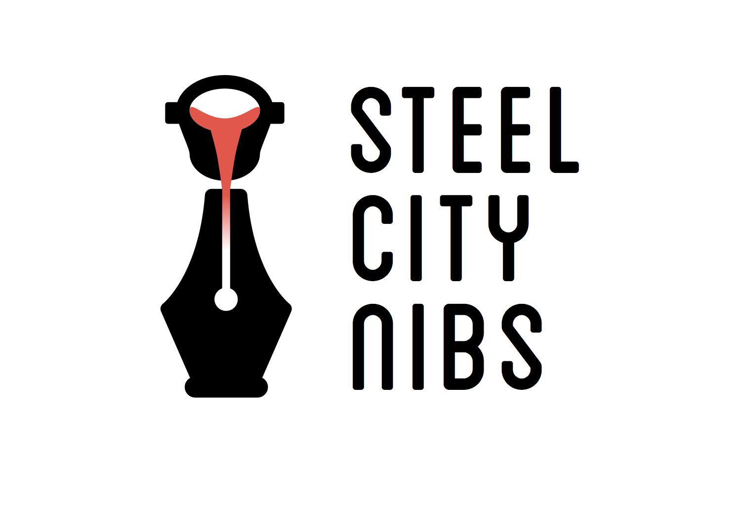
Steel City Nibs is a fountain pen club in Pittsburg.
I'm on a fountain pen spree. Type set in Blanch with increased character spacing and decreased line spacing.
Steel City Nibs is a fountain pen club in Pittsburg.
I'm on a fountain pen spree. Type set in Blanch with increased character spacing and decreased line spacing.
17 Comments
Oooh careful on the gradient there Cubby. This looks nice. There isn't too much happening its a nice tight logo. I just am not sure about the font yet. Can't really piece the symbol and font together.
*Looks sheepish*. I know, I know. The type will grow on you ;)
oh please i know the gradient is dangerous but sometimes its worth it! but this looks cheap
Let's not be too crass, webhunter—I am still a real, honest to God, human being. The gradient was not only meant to be a pragmatic consideration allowing the line between the molten steel and the nib slit to be blurred and to allow the slit to be filled with the molten steel, without having to fill the nib with a solid red (and to require the shaping of the end of the molten steel flow). It was also a stylistic homage to my partial inspiration, Art Deco, which sometimes uses simple gradients. http://goo.gl/q3Crnf
i ment that i actually very liked it with the gradient! also becacue without it it looks cheap :(
Oh no, I'm sorry. I totally misread your comment. I thought you were saying the gradient looked cheap. I agree, the other one does look cheap.
Yeah, I understand what the symbol is trying to convey, but it took a moment to register for me. It's a good idea, but it's a bit too abstract for me.
Here are some other crucibles I pulled from the first page of Google Image results for “foundry logo” (http://goo.gl/EvaaEu). Are these clearer? I'm wondering if, for clarity, I should differentiate the interior of the crucible like the areas I circled in pink in the image below.
The second row certainly works better to convey a crucible. For one, the steel flows much clearer into the nib, and there's a visible rim separating the inside from the top of the crucible.
Good research!
Hey cubby, I commented on that Seattle Pen Club logo. Same goes for this one: have you ever heard of "The guild of food writers" ?
I appreciate your concern, but it is entirely misplaced. As I have said before: many logos use the fountain pen nib, changing the geometry of the nib to create other symbols. A few articles for your own personal enrichment: http://www.logodesignlove.com/similar-original-logos, http://www.mikeindustries.com/blog/archive/2005/09/logo-originality, and http://www.underconsideration.com/speakup/archives/002412.html.
Simple solution: Extend the solid red all the way down the pen nib. It fixes your gradient issue, and also kind of looks like a thermometer to push the "hot, molten" theme.
Just a thought.
I tried that early on, but I didn't really like how it looked. Maybe it will grow on me?
I don't think the concern is misplaced. How many writer clubs are gonna use the fountain pen as a logo, in a very similar way like that? The Seattle one uses the same front view as this one. And the Food Writers Guild apparently too.
I'm not accusing you of anything. I like both this logo and the Seattle one, but it's not that original anymore. Maybe try to use the fountain pen in a different way? Dig up some creativity.
Did you even go to the links he provided?
Yes, I did go. It would just be good to see something different.
Honestly, by comparison theirs looks like a knockoff of this logo, even though it came first. So I don't know if it's really copying if you used an idea and executed it even better.