Brands of the World is the largest free library of downloadable vector logos, and a logo critique community. Search and download vector logos in AI, EPS, PDF, SVG, and CDR formats. If you have a logo that is not yet present in the library, we urge you to upload it. Thank you for your participation.


18 Comments
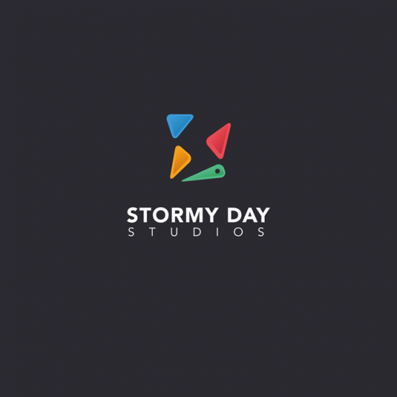
I can dig your idea of making " S " as a lightning bolt in a negative space created by rounded triangles. To some it might be a stretch, thought.
my first thought was "what are those shapes?" I have no idea what kind of studio this is.
I can see the idea, it needs to be refined though. :)
I don't understand the significance of the shapes (other than the implied "S"). To me it looks like a pre-made logo, designed without any particular customer/business in mind, and then you added the name under it.
The simplicity is nice, but unless you're someone like Stavengard, the negative space is going to be completely lost. I didn't even notice it at first. As others said, I don't understand the significance of the other shapes.
i got the idea about the studio, but nothing really aprimorated, somehow the symbol above is not really easy to find the "s" implicit on all these triangles.
By the way, is too colorful, if it's not a studio for childrens, try focus more on aplications.
Thank you all for your comments and inputs, very helpful (and some painful) :)
I've only been a member here for nearly two days and I already feel like I can learn a lot. Also, please have patience with my english.
To all of you who feel like the "S" isn't that obvious would it help if the gaps between the triangles would be smaller? Also perhaps making the rounded corners on the triangles less rounded would make it more tightened?
What is the significance of the triangles? The colors?
The blue, orange and the red triangles represent the bumpers in a pinball game. The green at the bottom a pinball flipper controller.
The choice of colors or the amount of different colors doesn't really play a significant role other than the logo needs to feel open and cheerful.
The logo is for a game developing studio. They want the logo to target a wide range of people in a wide range of age. They also want the logo to not box themselves in a specific genre. They will primarily develop games with educational purpose but at the same time they wish to not feel boring or related to homework or school. In other words they want to make education or learning fun with games.
Does this make any sense? :)
Ok- I do see the pinball flipper now (but not until now!). I like the idea, but I think the shapes are throwing it off. I think without a ball, the pinball idea won't be easily recognized- however, I'm not sure adding a ball here is a good idea....so I am wondering if putting some more thought behind your idea (going back to the drawing board so to speak) may spark some other references to the "old school game" theme you want, that may work better.
*oh and no one has mentioned this but is "studios" centered- it looks off to me!
Thanks for your input. Would it be totally wrong to play around with the shapes as they are but to try to make the flash "S" more visible or is this a dead end?
I get the point regarding the ball and everything, and yes as you mentioned the ball would be to much I think.
Your right, the "studios" are not 100% aligned to the left nor right side. When the text was absolute center and 100% width it looked like it leaned to the right with the "Y" on top.
I'd eliminate them completely. The S is cool in negative space though, but just cut it out of a rectangle instead! :)
Yeah, I started out doing it in a rectangle but I felt it was to "boring". Also regarding the name "Stormy Day" I wanted a bit more action to it. With the "S" cut out in a rectangle the whole thing looked a bit stiff.
But perhaps the gaps is to much. I will try to make it look more like a solid rectangle by closing the gaps.
what does pinball have to do with the business? my best guess was that they were actually different colored erasers. but anyways, why did you choose them?
By business you mean the game industry in general or the clients specific business? In my mind pinball is a form of "play" just as any game, digital or not. I did like the idea of pinball as a nostalgic and analouge touch and the symbolism for play as it is quite "hands on". I could choose a more digital symbolism but I did like the idea to go back to the roots. Perhaps I'm overthinking it...
Am I the only one to see a lightning bolt before an S in the symbol?
I think this is pretty clever.
I'd spend more time working on that symbol though. Right now, the different elements seems to float around a bit too much.
Thanks for your input! Yeah, I kind of realize that all the parts is to spread out...
Do you think the general idea is something to hold on to or is this another kill your darling situation?
I think the general idea is great! You just got to refine it some more.