super mex lager
ricachiu@gmail.com | Sat, 10/13/2012 - 20:20
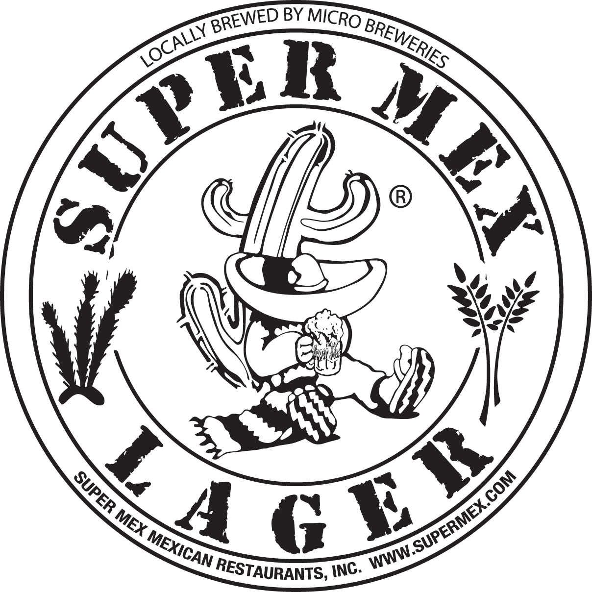
Brief from client
This is a logo that was created for a STAMP look like!
It has been used fora beer tap handle and other restaurant promotionals.
This is a logo that was created for a STAMP look like!
It has been used fora beer tap handle and other restaurant promotionals.
7 Comments
the font is not suitable for that but stick with the idea.
You're going in the right direction, but right now it's too cluttered, especially with that horrible font. The color, or lack of there of, makes the whole logo unappealing and dull.
EDIT : sorry I meant to give a green thumb for idea.
My only concern is that it is cluttered as Putz said. The cactus' and wheat are the problems. It's a good idea though.
Take out those little cacti & wheat on the sides - get a bit of color in the logo, the font - ok, does not disturb me much, the effect is not bad - looks like strong beer (more than 8%)!
You might try to simplify the mexican guy...
keep working, I'm not sure at all about this, the logo should have some color, is too black.
the drawing in the center is good, but the font in the outer circle needs to be change, to much info for me.
Thank you Doods,
I'm working on a new version and I'll definitely change the font in the out circle.
This logo it's already used for promotionals. it was bought by client who wanted this font so it's "what the client wants". also, I already submitted for the award.