Brands of the World is the largest free library of downloadable vector logos, and a logo critique community. Search and download vector logos in AI, EPS, PDF, SVG, and CDR formats. If you have a logo that is not yet present in the library, we urge you to upload it. Thank you for your participation.
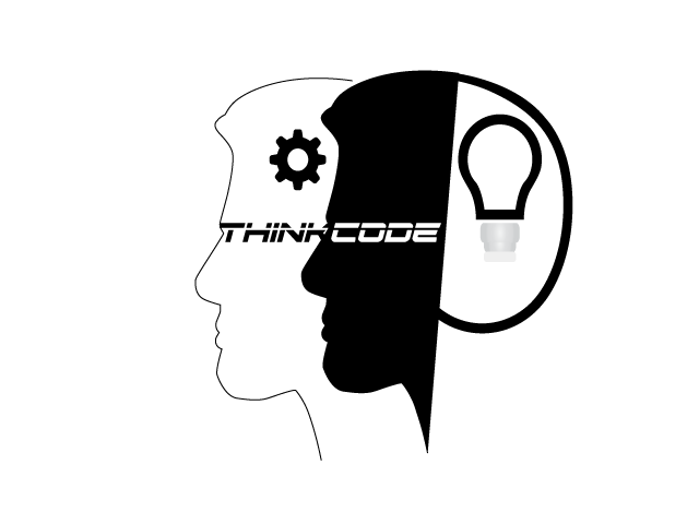
I think you might need to think about this logo design differently to solve the problem of over-complexity and the lack of unity.
For example, you have the text crammed inside the symbol too much. The shape of the right head is poorly rendered. Likewise with the lightbulb. Line thickness has no consistency. Overall, this needs to be reworked.
2 Comments
I think you might need to think about this logo design differently to solve the problem of over-complexity and the lack of unity.
For example, you have the text crammed inside the symbol too much. The shape of the right head is poorly rendered. Likewise with the lightbulb. Line thickness has no consistency. Overall, this needs to be reworked.
Neither a light-bulb nor a gear are different ways of thinking. They are the standard ways of thinking.
Sorry.