Brands of the World is the largest free library of downloadable vector logos, and a logo critique community. Search and download vector logos in AI, EPS, PDF, SVG, and CDR formats. If you have a logo that is not yet present in the library, we urge you to upload it. Thank you for your participation.
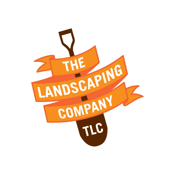
Thanks Shawali! i did have the bottom of the Shovel extended a bit more but was worried that it was making the whole thing a bit tall. Think ill extended it though as it would help define it as being a shovel. Ill re-look at the curves or the text as well :) The only thing i was concerned with in this version is if someone looked at the logo could they tell its for a landscaping company straight away?!
Looks fantastic.
One extremely minor thing, and this might just be a matter of opinion on my part...
I would fix the end of the ribbon at the top, where it flares out into the triangular shapes on the end, to match a bit better with the bottom. I like how the weight of the triangles on the bottom end of the ribbon are more equal, whereas the top looks a little unbalanced.
That's just me being super nit-picky. Even if you didn't make that change, it's a great-looking mark you have there. I dig it.
8 Comments
That's one really cool logo.
I would extand the stick of the shovel. Right now it looks a bit like a bomb.
You want to fine tune the curve of the text, as it does not match exactly the ribbon.
Excellent job, M@!
Thanks Shawali! i did have the bottom of the Shovel extended a bit more but was worried that it was making the whole thing a bit tall. Think ill extended it though as it would help define it as being a shovel. Ill re-look at the curves or the text as well :) The only thing i was concerned with in this version is if someone looked at the logo could they tell its for a landscaping company straight away?!
I think that when the shovel would be more obvious, it'll work. Anyway, the logo shouldn't give informations as much as it should leave an impression.
True :)
Damn, the more I see this logo the more I love it. You really nailed this one. I can already see it on the side of a van, on t-shirt, etc...
Looks fantastic.
One extremely minor thing, and this might just be a matter of opinion on my part...
I would fix the end of the ribbon at the top, where it flares out into the triangular shapes on the end, to match a bit better with the bottom. I like how the weight of the triangles on the bottom end of the ribbon are more equal, whereas the top looks a little unbalanced.
That's just me being super nit-picky. Even if you didn't make that change, it's a great-looking mark you have there. I dig it.
A lot of work put into this. TLC makes me think at Beyonce's group, that makes it awkardly easy to remember. :))
Thank you all so much for the great feedback! ill post a new version soon with all the little nit-picky parts looked at :))))