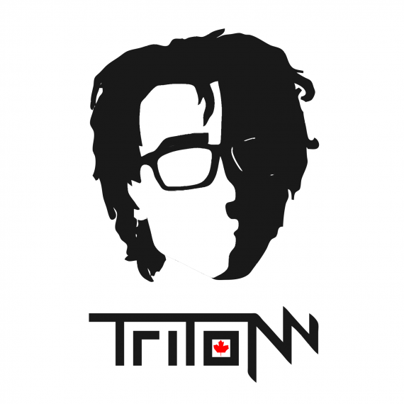
Tritonn
tritondreyja | Tue, 02/02/2016 - 19:24
Brief from client
Simple logo for independent teen audio producer

Its a simple logo for my soundcloud, i produce on my spare time. looking for critique on the overall idea, because i am fixing the little details already.
I traced over a picture of myself that i found to show recognizable features, and broke it down into 2 colors and i think it looks pretty damn cool, but just want to get feedback on the logo execution


4 Comments
If this's been done by a teenager, this is not too bad!
First off, I would just get rid of the symbol. The word mark works pretty well on its own.
That being said, I read "Tritom". I like how the two last characters break off from the rest, but it's a bit confusing as it is. Find a way to makes thee two N more legible.
Not sure if you really need that maple leaf. If it was more stylized and graphically consistant with its environment instead of just being a clip art, it would probably work better.
Keep it up!
Keep the symbol for branding purposes, but for a logo I could see you losing it in favor of the logomark.
The leaf needs to definitely go. It really adds nothing, and looks out of place.
Yeah, the symbol is solely for branding because to anyone who knows what i look like, it is instantly recognizable. haha i guess ill leave out the leaf, or actually make my own to go with the rest better because everyone online assumes I'm not canadian (for obvious reasons)
either way im glad this was presentable enough to receive feedback of this sort :D
That leaf belongs to Canada. Please return it. We are lost without it.
Besides that, the wordmark is nice and memorable. A few tweaks and I think it is done.