umdesigner
umdesigner | Thu, 05/26/2016 - 17:24
Brief from client
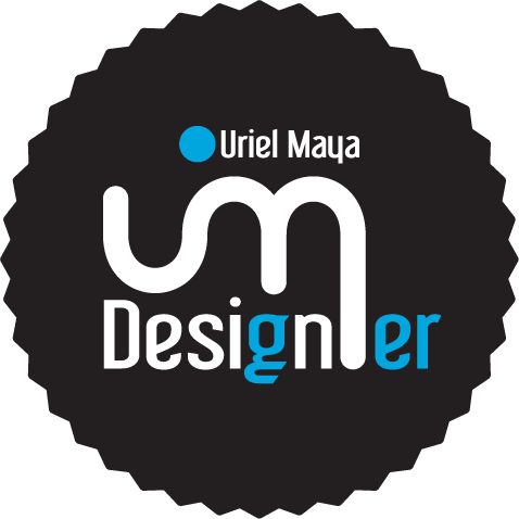
This is a personal logo, the idea was to make something simple but concrete , the imagotype is fused U and M , these being the initials of my name. adding the word designer , separating "design" with two colors . The colors I'm not sure they are final .
Welcome suggestions and constructive critique colleague. Thank you


9 Comments
Before I cast a vote or critique, may I ask what the significance of the "g" and "er" being a different color is?
The "er" in different color, is to put two words in one, design and designer. And "g" is only visual.
It already looks like Design ER without the er in a different colour. It really only separates something that doesn't need more separation. In my opinion.
This is way too complicated. You need to simplify this logo drastically.
Just keep the UM symbol, which looks good. No word cut in half, put your name right under, more prominent than "designer" (you're name is what makes you unique), remove the circle. Right now the composition is all over the place.
Keep working on it!
Following their suggestions , and removing some elements.
Yes.
No.
Hell no!
Spot on!
On top of all the comments and suggestions that you received - your symbol forms a cool looking elephant facing west with an upper portion of " u " being served as his trunk.
Thank you guys for your advices. I added new version changes.