Unikum
Jokkmokken | Thu, 07/28/2016 - 21:58
Brief from client
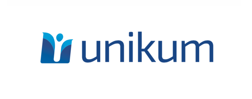
Logo for a company that develops and manages a business system for small and medium sized companies.
The logo should focus more on human side of running a business rather than improved sales and pure numbers. Also the logo should look trustworthy and serious.
16 Comments
Perfect, don't change a thing.
This looks very nice. Personally, I would prefer a cleaner typeface- this one is not bad, but it's the varying line weights. I think a solid, even typeface would give more of the trustworthy vibe.
Good job =)
Get it, will try to find something more suitable, I simply don't want that typical digital company font style.
Well like I said, yours isn't bad, if it makes you happy then roll with it!
It was just my personal opinion! =)
I'd love to see a version of that cool symbol with a round bottom.
It feels to me like it's just cut off. To be honest, i'm having a pretty bad bandwidth and I thought at first that image hadn't finish loading =)
But all in all, this is a pretty solid effort. Good job!
yea this looks really good and well put together but one thing that is really bugging me is that the symbol is on a slight slant whereas the letters are straight up. I think both should match, So either the symbol should go straight up or the lettering should be slightly sheared to match the same angle that the symbol is. that's just my opinion though of course! if you like it how it is then leave it.
This is my nagging issue with the logo as well.
I will take a look at the font since there are some concerns about this. My initial thought was that I didn't want a font that was angled since I wanted the symbol to stand out from the name and text. Although the symbol and text do have to match of course.
I will try some other fonts and see If there's anything that works better. Thank you all for your feedback, much appreciated.
I think instead of approaching this by making the font match the symbol's slanted angle, why not straighten the symbol?
I'm going to agree with Joy's comment about the font. I think the varying weights are distracting here. Address these two issues and I think you've got it nailed.
Okey, how about this? Removed the angle of the symbol and changed the font. Also a test to see how a rounded bottom would cope. What color combination do you prefer?
I like C and D. Since the text is a dark blue, I prefer the symbol to be mostly light blue.
B and D for me. But I didn't mind the slanted symbol.
The font is great. Good job!
I like D + B the best. The round bottom is nice.
Aaah... decisions, decisions, decisions. :)
Okey, how about these then. I do agree with the color combination, it looks more interesting with the symbol mostly light blue and I the rounded bottom version is also nice.
But what about that angle. I do like the slanted symbol but I'm not so keen on the slanted text.
It is B for me, or F. Slanted and straight D isn't working for my eyes. :)
D.