Vander Studio
kikippi | Fri, 12/01/2017 - 10:00
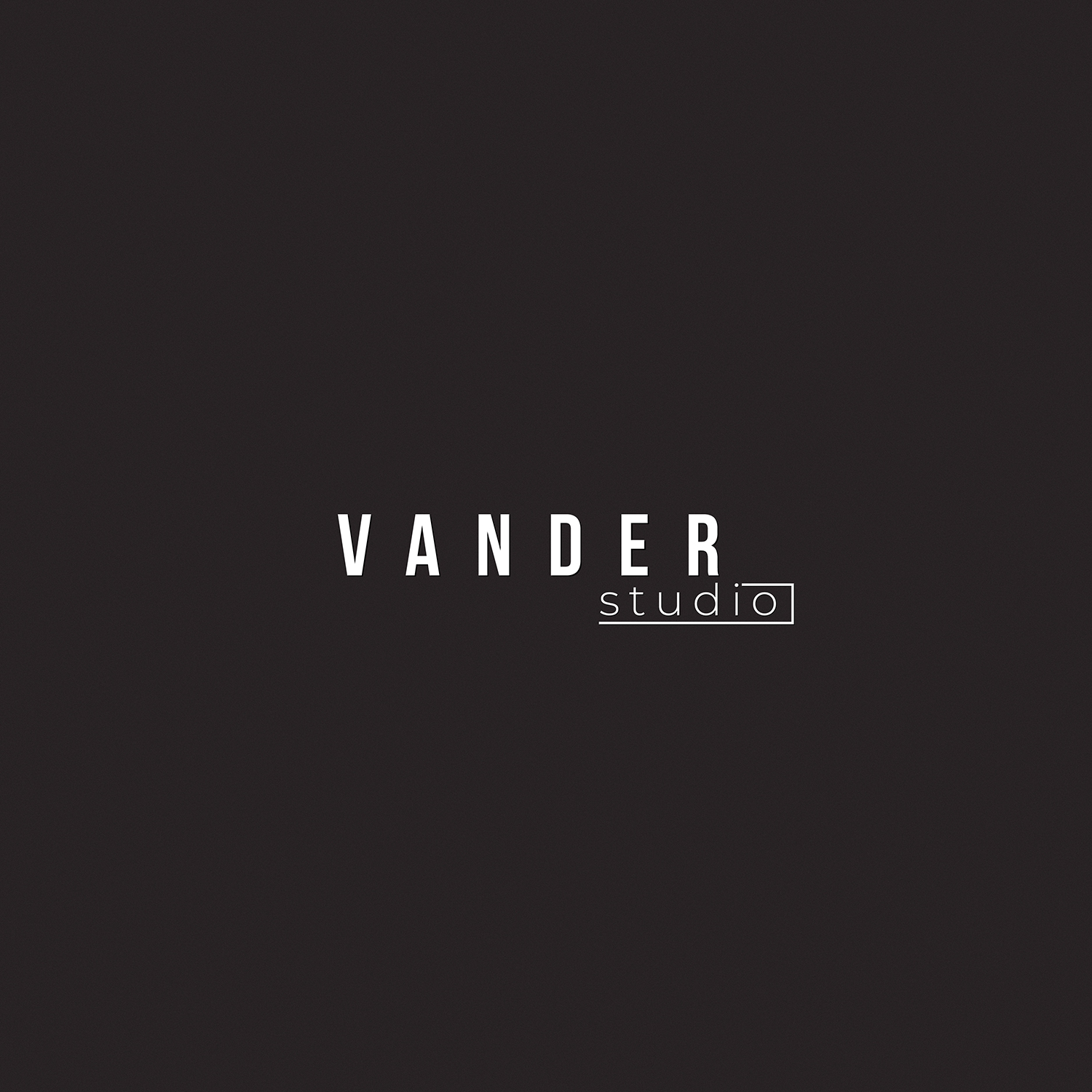
Brief from client
Logo design for a photographer studio.Studio works are mainly portraits in black and white, his style is classic, not too fashion. this said, the logo should be appealing for fashion brands, simple, clean and modern
5 Comments
Better than the last one. Still needs more work,
I got no idea what to do next, u got any suggestions????
I'd simplify the studio text. The typeface you've selected for Vander is great, the spacing looks good but the line around studio doesn't work for me as well as the right alignment. Maybe just a simple key line box around studio and then centre it. Or even try putting the text on a shallow curve/arc with a subtle line above and below the studio text?
Here's a similar example that may help!
Hi. You need to change the font color and background color. Black font color and white background color are more expressive than vice versa. Vander studio - the name is not bad, the placement on the page is also good. I do not recommend changing the type of font, leave it as it is.
I’ll leave an example from the site https://xn--lck0a4d411qemf.jp/%E3%82%AA%E3%83%B3%E3%83%A9%E3%82%A4%E3%83... below.