Velvet Monday
weejee | Wed, 05/06/2015 - 21:13
Brief from client
Velvet Monday is a worldwide recruitment firm with a focus on mobile product management positions. Their target audience is mobile product managers ages 30 to 45 years.
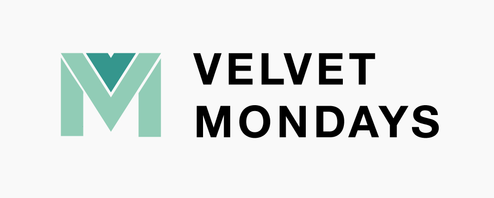
I pulled the V off of M to make sure both letters are clearly visible when the logo is in black & white and I got rid of the gradient. I also changed the typeface to a much heavier one to balance it out.
Thank you all for the feedback so far!
11 Comments
It is improved , but now the " V " part looks like a heart, too.
I agree, it does look like a small heart. So the V should be more prominent than it is now?
In my opinion it does not seem appropriate to the small V over the other is superfluous in the symbol.
Just make the Middle colour the darker colour and remove that little V thing. Then it is M & V!
Thank you for your feedback. You are absolutely right, I could easily remove the small v at the top and give the top piece of the M the darker green to make a more prominent V.
Just - is such a negative word...
I don't see it as being negative here. It might have sounded a little demanding if read in a negative tone, and I probably could have said 'If you just', but there was no negative feelings at all associated with my post.
I quite like the direction this logo is going in and I have been more than happy to help so far. :)
Your title reads " Velvet Mondays " - so, for that reason alone - we should see " V " first and then " M " second. Right now it is " M " and then " V ". Please, make sure of that.
maybe it can be done this way, by using a negative space...
BOPOTA, thank you so much for your feedback and illustration. You are being very helpful.
Although your design looks a bit like a bat flying towards you, I do like the idea of negative space. I like your font choice as well. Thanks for pointing me in interesting directions.
Thank you, Weejee! Thank you for your kind words! I'm glad to know that somehow was able to help you with your quest to achieve a logo for Velvet Mondays. Please, feel free to ask me on any of your future designs or the current ones. Here is my email : hacobcem@gmail.com My name is Felix. I really would like to participate in your art work. I do not have an Adobe Illustrator and would like to get one on my own soon. However, will do my best to give you a good advice when you need it.