Water
shanuea | Thu, 08/21/2014 - 00:20
Brief from client
Logo for university water fountains and reusable bottles. Must be vibrant, fresh.
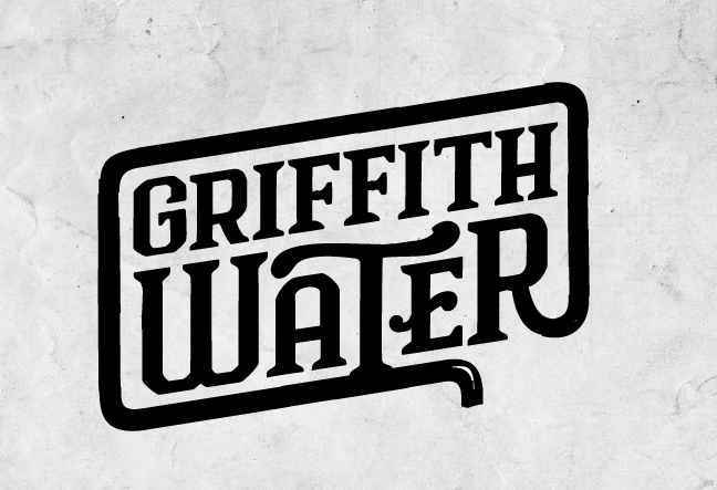
For some reason my upload was deleted - here it is again. First version. Critique / suggestions welcome.
5 Comments
I love this idea. The one with the smaller "A" and "E" in water has a lot of character. Simple and gets the point across. Although, i did think it was for a water utilities company, and not a drinking water supplier. Im also not sure if this matches the brief of vibrant and fresh- the font with those thick serifs feels pretty retro (even though i do like the font).
It also seems like some of the lines could be cleaned up (maybe it just rendered weird on here?). The whole outer border part could use a lot of clean up. I see a stray white pixel on the bottom right corner and the highlight on what i think is a water pipe on the bottom doesn't look right to me especially when i t doesn't appear on any of the other corners.
Again, black and white doesn't exactly fit with fresh/vibrant. Blue is the obvious go-to color for water companies. Try using a nice combo of blue and a complementary color (or two different blues) for the two different words.
I think this logo (cleaned up) could work, but not for this brief.
Here's a cleaned up version, but yes I think I agree with your comments - this is not really vibrant.
Good work, shanuea!
Im liking it!
Well done!
Good eye for design.
I agree with the comment made about the association with a utility company. One thing that could be changed to enhance the color+vibrancy of the piece is to emulate a tank of water by including a water level within the piece, using blues as well as the black lines.
Overall, great work.