WAYKN
Brief from client
This is my own brand for clothing and other art over all. I know you may be thinking this looks like crap but I know, It needs refinement. The lettering is something I want to keep because it's kind of it's own logo, but The part on the left is more so what I want to work on. I wanted something bold and to match the look and style of the lettering..HONESTLY any feedback at all is definitely welcome, because I've put a lot of thought into this basic piece but I'd like fresh eyes and opinion on it. If it helps this is the meaning behind the name WAYKN: Open your mind to the impossible! There's ALWAYS a WAY to see through some one else's perspective. Because if you just stick to the facts they tell you, there's no room for a little imagination. When your AWAKE or sleeping, you can still WAKE up, or in other words, open your mind to new ideas and create something better.
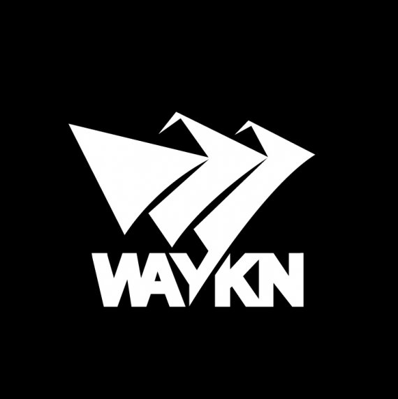
The thought process behind the logo on the left here is that it's kinda like a little city, three buildings all reaching upward to the sky seeking new limits to break giving people the ability to over see a city from the top giving them a better perspective or understanding of things. As for placement of these buildings I have them set up so they create W for WAYKN in a 2D perspective. The shadows on the building are on their right side. Suggesting that the sun is setting and it is becoming night time, a time where most creative thinkers or business men are still awake working to create something better or to be one step ahead.

"Flag/pennant waving is what I was going for but in a super simplistic sense as well as something that's something abstract looking! If you look its got the Three humbs like a W for WAYKN! the flag is placed so it looks like the leg of the Y is the pole and the flag is slanted forward! Like when an army charges! I was thinking of it in the sense of like charging into a new idea, or infiltrating a new area (perspective).
The main point of this attempt on this one was to get something that was abstract at first glance but had a purpose"
My Reply in my last version.^
then I went in and Updated the logo just a little


