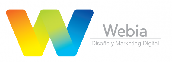
Webia
Brief from client
The name of the business is Webia. It is a web design, marketing and community management company I'm trying to start with some friends.
We want to have a friendly-modern look, priorizing out creativity and flexibility in every work.
Things we do:
- Wesite Development
- Community Management
- Online Publicity
- Graphic Design

Hello again!
I'm sorry for taking too long on this little update, I've been really busy with school and didn't have much time for the logo. But I'm back at it again!
I kept the logo the same way as the last upload as you can see, I think it's more w-ish? Been looking at the one with the lowered "wings" but couldn't really get a feeling for it.
About the text part, I'm still struggling with it as you can see. It's been really difficult for me to find the proper font. Even tried to design one myself but I'm not too good for it at the moment.
This is a small upload, I think the logo part is almost done so I'm trying to focus on the text. I feel I'm really close yet too far from finishing it haha.
Thanks a lot for your help guys, I really appreciate it!


3 Comments
That gradient is gorgeous, really well done. Usually gradients are frowned upon, but I don't agree that there are always hard rules about everything.
I think that the W is way too big compared to the text. I might make "Webia" all lower case as "webia" and increase the size of all the text. The font is a good pic, very clean but not boring. And I love the neutrality of the grey contrasted with the brightness of the icon. You may consider applying the same gradient to the accent line between the lettering.
Good work, I think this is very nearly complete.
Unterm Rad, said it perfectly. The Gradient is so Gorgeous!
Hint: try the word mark and subtext without any caps.
Also, remove the subtext in the basic version of your logo.
And yes that gradient is rad!