True Sweat
gdsalcedo | Fri, 02/23/2018 - 06:37
Brief from client
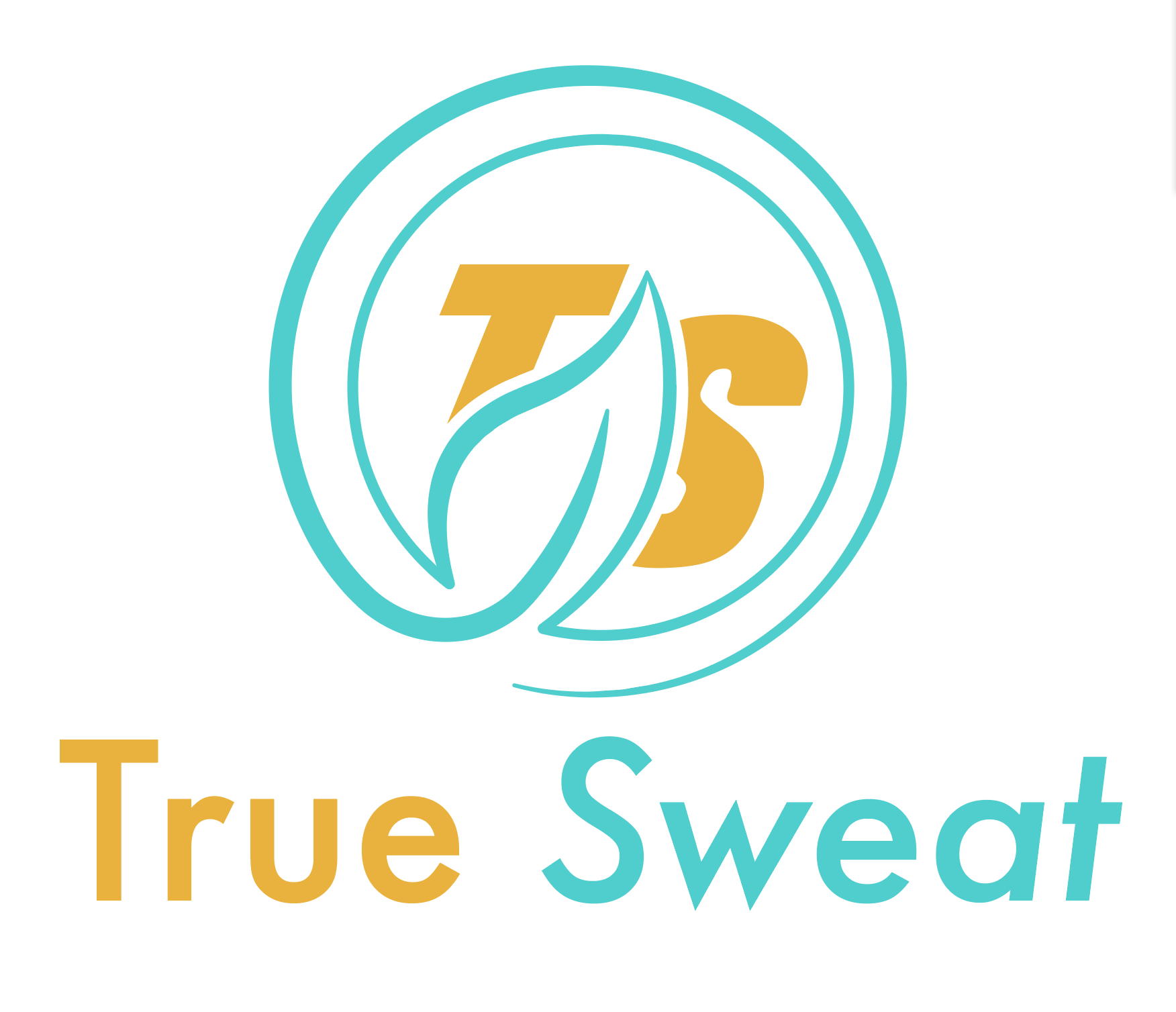
The client is creating an organic workout sweating cream. The cream uses matcha tea leaf and other organic ingredients. This is still on the sketch fase, so definitely no where near done.
5 Comments
Using a double typography, confuses
So is passing stock logos as your own.
I don't like how 'TS' is hidden. Is it even needed since the name is directly below the mark?
Colors are somewhat intriguing yet the orange may need a different tone to match the blue.
Don't understand the Leaf. I guess it's supposed to be for organic but it says nothing to the likes of the sweat cream. Wouldn't you want a sweat drop? (perhaps)
Type needs some work, don't like the TS hidden. Could stay on a rework with a bit more "logofication" also I am thinking all oblique would be best for the "true sweat" line then the TS normal or vice versa.
Usually when trying to achieve this effect of oblique / regular one font is let's say light and the other is demi-bold oblique and they may be pushed together with no space if the contrast is great enough. Also tracking tighter.
Try some different font's and rework the circle, and leaf, I was envisioning the possibly circular canister that cream's often come in with the drip mixed in. Since it's an odd product you may even consider adding what it is in some fashion.
This isn't working at all.
Diagnostic is pretty simple: lack of research, inspiration and sketching.
Treatment: a few hours of web browsing followed by a heavy dose of Pinterest, an to finish with pen and paper everyday for a week.