Coffee Stop
Bassam Hassan Zoghbi | Thu, 01/12/2012 - 18:58
Brief from client
Quem nunca parou para tomar um café, quando se estava em uma estrada.
Quem nunca parou para tomar um café, quando se estava em uma estrada.
Quem nunca parou para tomar um café, quando se estava em uma estrada.
Quem nunca parou para tomar um café, quando se estava em uma estrada.
10 Comments
Forgotten by the English
Who has not stopped for coffee, when it was on a road.
First off thats a Stock vector and its somebody elses work. I have seen that on a vector site some where. You need to be more original than putting clip art together and calling it a logo. Plus how the hell does that tree resemble an H and why are the trees and hills in there in the first place.
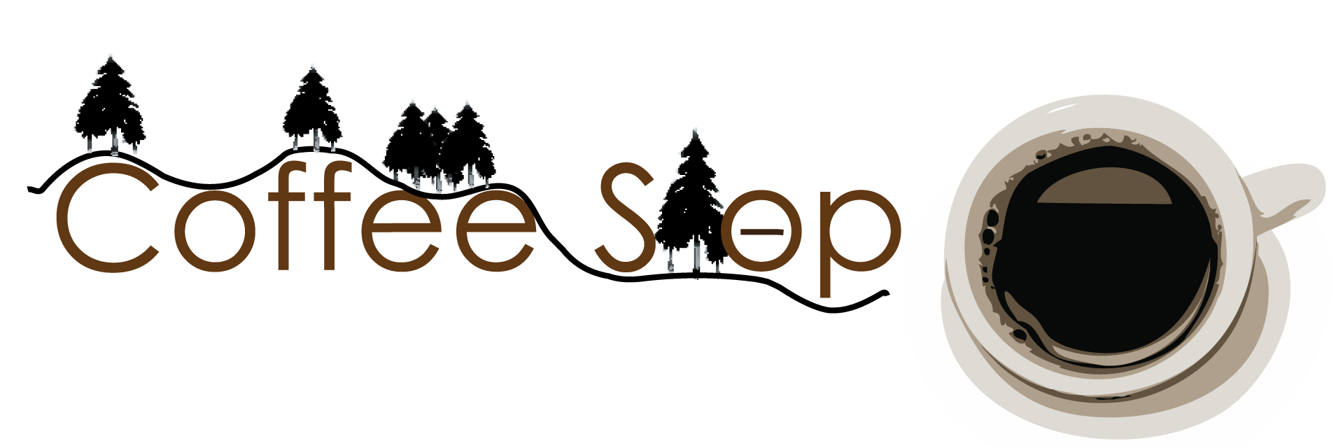
Trees and hills (road, woods).
The cup is not clip art. Only the trees.
Maybe if he had spoken in brief Cafe Monte. would have given another impression.
There is just too much going on for this to be a logo. It would be more of a marketing campaign. I can't tell what letter is behind that tree or why there is a line in the "O". Sorry.
to much going on for a logo...simplify is the best way
It's also too long... if this is someone else's work, revamp, get original use your digital camera and take your own picture and convert to vector...POW!!!
This is not a logo
yo le quitaría la taza de café o se la cambiaría por una mas minimalista sin tantos detalles, de igual manera borraría los pinos y lo dejaría con las puras letras "Coffee Shop" para que fuera un logotipo y no un isologotipo.
se me ocurre que podrías colocar en la letra ("o" de la palabra shop) una especie de vapor que indiquen una taza de cafe caliente
If you're in a good mood like this two stoners in my animated gif then.... nah, no way, even then this will look like total crap.
(click the gif to see them in action)
Read this and pay attention... it will steer you in the right direction-
http://justcreativedesign.com/2008/01/08/how-to-design-a-logo/