Kimi - Arte y Decoración
DavidBoom95 | Wed, 01/18/2012 - 23:35
Brief from client
ESPAÑOL
Kimi arte y decoracion® es una empresa colombiana dedicada a la elaboracion de objetos de decoración navideña. El logo representa la aguja con la cual se hacen estos adornos, ya que son hechos a mano.
ENGLISH
Kimi art and decoration ® is a Colombian company dedicated to the elaboration of decorative Christmas. The logo represents the needle which makes these ornaments, as they are handmade.
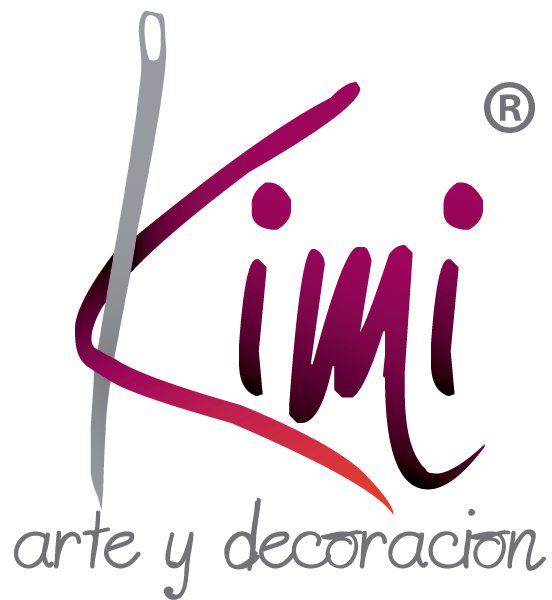
This logo represents the needle and the thread (K) of these decorative products, They are 100% handmade
9 Comments
"imi" looks great, but the "K" is begging for forgiveness. Make the "K" look like "imi". Lose the gradient too.
Keep the tagline lower-cased, but use a different font, some round sans-serif. Don't forget the accent in "ción"
I think if you just clean up the vectors it would be great.
Sorry~ but I am not a fan. I commend you on trying to create the letters, but they need a lot of work. As does the needle. The font for the tag doesn't work and it needs more room. Gradient is not necessary.
I think if this is the best you can do with your vector program you should look into a similar font for "imi" and dedicate your time to the needle/K.
A cursive "k" using the thread and needle might be more appealing, but I don't want to stress your skills.
Loose the gradients, please choose another type because none of the are working
Choose some complimentary colors and dont use gradients
It needs a lot of bezier curves smoothing to be able to work and even then I am not sure if the final result will be acceptable.
I agree with the others about colors/gradients, you need a better color scheme without gradients.
your idea is good but need a lot of works to do like they said with the above comment.
i think you need to take seriously rework what you want to do.not like this, make a perfect curves in your whole life.
me agrada la idea, pero deverias mejorar el trazado, la parte vectorial deja mucho que desear. y la palabra decoración lleva tilde en la O.
idea is great but need some more work.
i agree with most of the other comments, work on the curves so it looks clean, rework the K and change the font for "arte y decoración " ( put the accent ) not sure if that tone of gray is pleasing.