Becky Candy Salons
sneakybeast | Wed, 02/01/2012 - 09:58
Brief from client
Re-brand whole salon taking the old logo and bringing it up to date and more appropriate.
Also to include the beauty lounge which is a new concept inside the salon

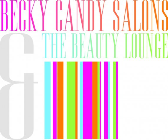
I have brought together the name candy and the whole candy stripes theme which I think works very well. The whole look of the salon is now based around this theme with certain walls inside the salon painted with the candy stripes. This logo is the bringing together of the two areas of the business but I have also worked on a separate logo just for the main part of the business which is the salon.


7 Comments
You have got to find a better way to do this. Right now it is an eye sore.
Loose gradients
Work on kerning
Work on Positioning
I am not trying to be mean, this whole logo needs to be completely re worked
I agree. It's too confusing. The ampersand is way too big. Try having the stripes first then the two lines of type (names) either in a vertical format or horizontal. Horizontal may be too long. Can you lose the "the" in beauty lounge?
If the stripes idea needs to be there, try losing the white spaces and aligning the rest of the stripes together, use a sans-serif typestyle (as there are so many letters) in white overtop the stripes. For a logo there is just too much going on right now to have serifs, gradients, and different sized objects.
I can hear those colors screaming from miles away and that is not the worst part of all this.
My advice: bookstore > books on graphics & logo design > study hard.
Oh dear, not working at all. See the above comments.
My eyes! again.
I don't know where to start looking, there's no shape, no arrangement of elements here.
What they said :.