Brands of the World is the largest free library of downloadable vector logos, and a logo critique community. Search and download vector logos in AI, EPS, PDF, SVG, and CDR formats. If you have a logo that is not yet present in the library, we urge you to upload it. Thank you for your participation.
By better- I also mean differently. Yes he/she can use the idea of a "PD" logo. But executed better than the existing logo because it is lacking and is too similar to an existing logo.
You can have a base idea that that can be executed in various ways. Like I can have an idea of using just an "M" for a logo.. The idea is fine- just don't create an "M" out of two golden arches...
Unless I am misunderstanding the definition behind "idea" in the thumbs up/down criteria..??
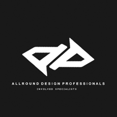
I understand the idea here is to design a symbol using the letters "dp". Good.
The implementation or execution of this symbol here looks like the example posted by briankav but you'll always going to find that in a 1, 2, or 3 letters symbol.
I think this "dp" doesn't say much. It's too elaborated and skewed.
9 Comments
It's to similar to this for me.
Yeah..
what a coincidence" o_o
with what briankav stated, i say scratch the entire idea and start fresh.
I think you can use the idea, but it needs to be executed better.. but be warned- every PD/DP name out there will have done a version of this.
From what I can see of the type it's Helvetica which is almost always nice.. But, it is unreadable even at this size.
i would disagree with the use of idea, because it's too close to resemble that logo which already used the design
By better- I also mean differently. Yes he/she can use the idea of a "PD" logo. But executed better than the existing logo because it is lacking and is too similar to an existing logo.
You can have a base idea that that can be executed in various ways. Like I can have an idea of using just an "M" for a logo.. The idea is fine- just don't create an "M" out of two golden arches...
Unless I am misunderstanding the definition behind "idea" in the thumbs up/down criteria..??
ahh ok, nevermind i got what you were saying, i misunderstood it. then yes, my apologies, i'm all for it then.
I understand the idea here is to design a symbol using the letters "dp". Good.
The implementation or execution of this symbol here looks like the example posted by briankav but you'll always going to find that in a 1, 2, or 3 letters symbol.
I think this "dp" doesn't say much. It's too elaborated and skewed.
exactly.. the idea is fine.. execution needs work.. but, you are going to run into similar DP designs no matter what.. : P