Wendy Rowe
marlow.perceval | Mon, 02/06/2012 - 18:49
Brief from client
For a well known and established makeup artist's blog and makeup academy. High fashion/beauty, on trend, fashion illustration. Projecting an individual personality that is an authority on fashion and beauty trends etc.
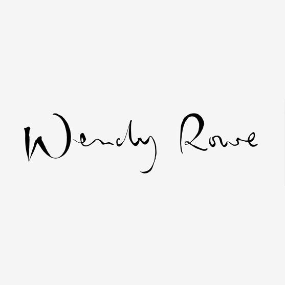
I felt the hand lettered route was appropriate for the individual. The logo needed to be feminine but also sophisticated and have an air of creativity and authority.
12 Comments
is this their actual signature or did you create a signature for them?
I've created this for them
ahh, would've been nice if it was the actual client's signature. to some when they see this, they'll think it's their signature, and when the make up artist signs anything, it won't match up. i think the idea of this style is nice but i don't think it would equal up to when the actual artist signs anything as the signature will not match up. some others may think differently but just my opinion.
Agree with above, clients actual signature is a lot better. I did my own signature for mine and thats the only thing that made me happy
I agree also, the actual signature would be better. I did ask for a version of theirs but it wasn't very interesting and not concise enough for a logo.
Its looking quite neat at the moment, I'm liking the unperfected edges of some of the letters it gives it a personal feel to it. But it still feels like its missing something key that will complete it, right now it feels quite naked and unfinished. Mess about with it though because it is quite nice.
If she loves what you have designed for her, she will learn to draw this mark.
i agree with natman...in plus i feel it's dry...and the edges some sharp some soft that doesn't work....i think better excision will make it works....
A bit smoother edges and lines, and it will be much better.
And I agree with luenib, she will change her signature to this ;)
i ever like signatures as a logo.. and in this case i like the handwrite typo chosen.
BUT...i agree with other guys, the actual costumer signature redesign is more acceptable.
Also you can try to combine a little symbol (with one more color)
its nice creation. I agree if it would connote the signature then it would add more value. Anyways good work ! i love it.
I think the lines need to be cleaner