Brief from client
logo for art magazine 'Art Effect'

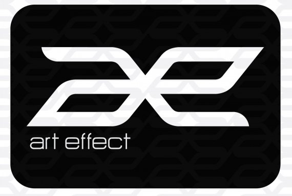
this logo created for Art Magazine, Art Effect
CONCEPT:
Art always change and grow, because of that, art make many effect, and that effect has many variety too (infinity)
that logo made by alphabet 'a' and 'e'
combined by infinity syimbol
6 Comments
the ideea is good i think. the font is too small for a magazine though. make it so that it stands out more. also the symbol could be improved. infinity is rounded... that means it never stops.. yours is sharp.
this is only a rough sketch but maybe something like this?
thanks kaosme, i'll try to improve that logo
Like it! What is with the background? I think that the logo is great but does it have a color other then black?
thx natalic,
i used patern in background
the colour for this logo just black and white
This is awesome I have a record label called Awakened Enterprises and was wondering if it would be alright to use this logo?
Kind regards
Jazz