Brands of the World is the largest free library of downloadable vector logos, and a logo critique community. Search and download vector logos in AI, EPS, PDF, SVG, and CDR formats. If you have a logo that is not yet present in the library, we urge you to upload it. Thank you for your participation.
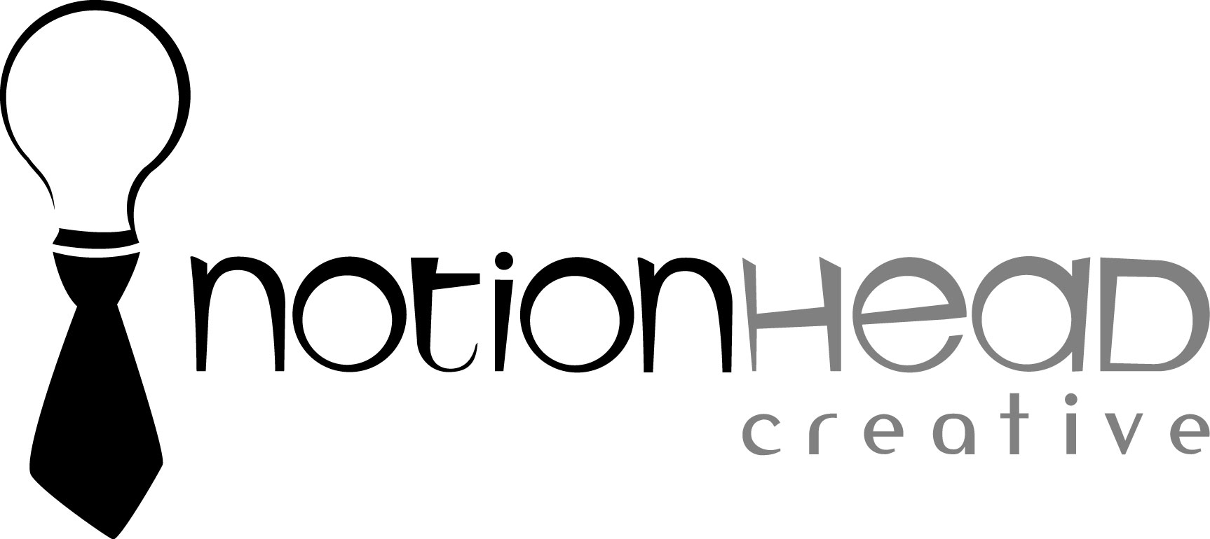
Notionhead
imdiekem | Tue, 06/05/2012 - 03:35
Brief from client
Working on my own brand. New to this critique. Appreciate all feedback.
Appreciate the feedback. Thanks for giving specifics as to what isn't working. Will work with the fonts. Seems to be the most common criticism. Is the fact that a symbol has been used extensively inherently bad - especially if it is being used in a unique way? Does familiar automatically equal bad?
15 Comments
I like the symbol... but i dont like the font you used. can you show more fonts options?
Sure thing. Appreciate the feedback. What is it about the font that doesn't work for you?
Yes! That font really doesnt work
like the symbol but please chance the font.
choose a more easyer font. not whith al the sekwed lines
I actually like the logo and the fonts but i will admit it is hard to read, it looks fun maybe a little more serious font they are mentioning?
Appreciate the feedback. I'll play with it more. This is is actually a custom font, but I agree that it may be a little too playful.
The symbol of the light bulb is a old and it's been seen everywhere.
Not a fan of the main font, too unstable. The other font is the one used by Scrabble. It's too recognizable, imho.
Appreciate the feedback. Thanks for giving specifics as to what isn't working. Will work with the fonts. Seems to be the most common criticism. Is the fact that a symbol has been used extensively inherently bad - especially if it is being used in a unique way? Does familiar automatically equal bad?
the symbol it's ok but your font of choice is unfit for a logo, go with something more simetric and solid.
Again, thanks for giving specifics.
on first sight, the graphic reminded me of a noose. Sorry. Maybe add stripes or paisley or dots. I think the type is fun though.
what is the idea????
the idea is good but the font doesnt go here and the color it´s too bored, use warm colors like a yellow or red or use both them
Im with imdiekem!!!
I like but a logo black & white need helvetica. My opinion.
start over and change idea, and the other one not shows how creative u can be ;)