Brands of the World is the largest free library of downloadable vector logos, and a logo critique community. Search and download vector logos in AI, EPS, PDF, SVG, and CDR formats. If you have a logo that is not yet present in the library, we urge you to upload it. Thank you for your participation.
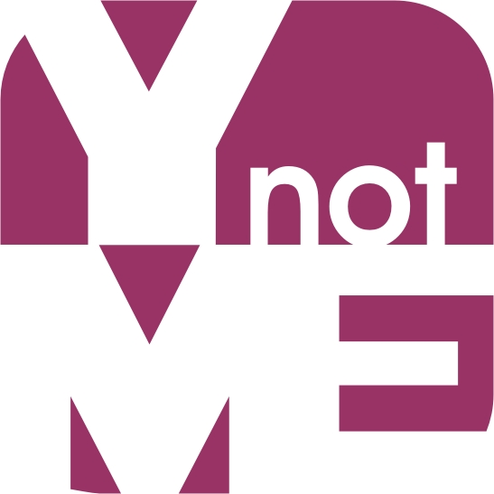
So I guess the message to your clients is 'Why not me'?
The idea could work i suppose, but not in it's current form imo.
I couldn't see this working effectively on a business card or other. I'd go back to the drawing board and make some sketches. I agree with arthurmani about the colors too.
I also have a problem in general with using the letter 'y' instead of the word 'why'. unnecessary txt spk in my opinion. A pet hate of many.
Also there is a successful agency called 'why not associates' - just for your information / inspiration...
Im not a fan of the logo i tried to play with it keeping your layout but was not happy with any of the ideas i came up with lol
im sure there will be a lot of people telling you its ahrd to read
Well if they can't read it then I guess they're not for you. Looking at the symbol at hand, a few suggestions. First Monito's example fixed a problem with the "M" cutout. The second thing is the rounded edges of the square. They don't work in any of the "ME" areas, looks more like an error. Third, what would upper case letters in "not" look like? Lastly, the width of the letter segments seems to be inconsistent, for example the leg of the "Y" is so much wider than the legs of the "M" or the branches of the "E" are much smaller than the arms of the "Y"
To me, that's a mess. There's all sorts of tripe I could spurt out about putting out a disorganised or sloppy image of yourself, but that sinks to insignificance when we consider how unpleasant it looks.
6 Comments
Can you upload a smaller version? It is hard to critique at this scale. I think you should try a different colour and add some relief to it.
So I guess the message to your clients is 'Why not me'?
The idea could work i suppose, but not in it's current form imo.
I couldn't see this working effectively on a business card or other. I'd go back to the drawing board and make some sketches. I agree with arthurmani about the colors too.
I also have a problem in general with using the letter 'y' instead of the word 'why'. unnecessary txt spk in my opinion. A pet hate of many.
Also there is a successful agency called 'why not associates' - just for your information / inspiration...
http://www.whynotassociates.com/en/futurelab/futurelab.php
Im not a fan of the logo i tried to play with it keeping your layout but was not happy with any of the ideas i came up with lol
im sure there will be a lot of people telling you its ahrd to read
Well if they can't read it then I guess they're not for you. Looking at the symbol at hand, a few suggestions. First Monito's example fixed a problem with the "M" cutout. The second thing is the rounded edges of the square. They don't work in any of the "ME" areas, looks more like an error. Third, what would upper case letters in "not" look like? Lastly, the width of the letter segments seems to be inconsistent, for example the leg of the "Y" is so much wider than the legs of the "M" or the branches of the "E" are much smaller than the arms of the "Y"
Thanks guys, I will take this one on again at a later stage. I take note of your suggestions.
To me, that's a mess. There's all sorts of tripe I could spurt out about putting out a disorganised or sloppy image of yourself, but that sinks to insignificance when we consider how unpleasant it looks.
No.