1000 colores
bucker | Sun, 07/08/2012 - 23:18
Brief from client
graphic design and printer
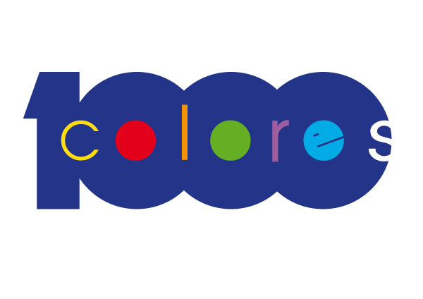
4th version of 1000 colores logo. No black and more color (although I hate to mix many colors, the name is requesting it)
graphic design and printer
4th version of 1000 colores logo. No black and more color (although I hate to mix many colors, the name is requesting it)
15 Comments
hmmmm... sorry but no.
I would appreciate some reasons to your negativity.
I think this is my best. I have changed the color of the c, l and r to yellow in order to show less colors. But this design is the best of all the versions
5th version Just small change in color
This is a pretty Interesting Idea, It works, The S at the end does not. you have all your type not stretched and unifom then the last s stretched...
Maybe Keep the colors uniform?
This still needs work but the colors used in this is cmyk also used in printing industry.
This is a good idea. I prefer the black + colors inside version myself, but I am not fond of the S being cut off. I'd experiment with fonts here, I'm not sure what you have is working with the idea, but again, I like the idea a lot and I think it just needs a little bit more attention to be really nice!
Thank you very much for your comments. This forum is awesome!!
I like what monito studios did. Now Im trying to find out what combination of colors is more popular asking everyone, and Im surprised that some people hate using black and others love it. Most of the people like the S that way and surprisingly the 2 previous comments does not.
I will tell you what I like to see what you think:
1) I like the S very much. Its not streched and its not cut, Im just playing with the negative space, thats the reason that it must be white like the background
2) Colors: I cant find the best solution because I would prefer to choose the colors depending on the context that the logo were going to be used. But thats not possible so Im still trying to find out the best solution
Thanks to all again
Monito studios, what colors did you use??
I'd wager a guess that Monito used 100% CMY for their colors! (100 % C, 100% M, 100% Y.)
It bugs me that the S is cut off in their version- but I do like the "e" being an actual "e" and not how it was before. I kept thinking it was a winking Pacman symbol or something.
i guess you got to go back to work it from beginning. You got the impact you want with the massive "1000" but the letters inside are really a pain in the ass. 1000 thousand colors means more than cmyk or rgb so go with more colors, more geometric, more dynamic. Exclude the massiveness of that logo. Inspire yourself from the field you are working in, see how the machines work, how a laser printer makes and mixes the colors...stuff like that.
What do you mean with that? Give an example
http://computer.howstuffworks.com/laser-printer9.htm
http://thelaserprinters.blogspot.ro/2010_05_01_archive.html
http://www.frankswebspace.org.uk/ScienceAndMaths/physics/physicsGCSE/usi...
also you can use cmyk stuff like:
http://image.shutterstock.com/display_pic_with_logo/169471/169471,121537...
http://asmartbear.wpengine.netdna-cdn.com/wp-content/uploads/cmyk-color-...
http://imprint.net.my/v2/images/stories/printing1.jpg
Well now, the idea is to simplify so I will stop here.
I can't wait to see the results:D
Thanks for your try but your first 3 links doesnt inspire at all
I guess what you mean is that you would prefer many bright colors as the name is asking, others prefer the use of black and white. Im now trying with different colors
Do you prefer the S cut?
thanks for your feedback regarding my feedback and sorry it didn't helped you. I am a little weird about my inspirational sources, i know. To put it as I imagine it: a storm of colors in a technological context. So you should go with round and square forms in the same time.....that's my vision.
Good luck there.
I prefer the blue "1000" but would change the letters c, l and r to white (and same font as the "s"). The "e" looks much like a "Smiley" that lost one eye. Try to give it a less funny look. In my opinion version no. 4 is the best one.
Thanks razerrath!!! All this work and I´m now starting to prefer version no. 1