Buffet Mig Fest
dinhodemarcco | Tue, 01/29/2013 - 20:02
Brief from client
The client wanted a logotypo playful, joyful and simple for your event space.
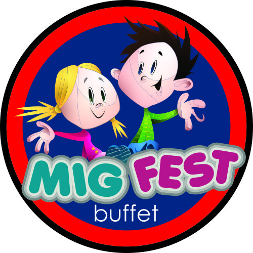
The client wanted a logotypo playful, joyful and simple for your event space.

 Partnered with Clios.com | Ads of the World
Terms of Use | Privacy Policy | Cookie Policy
© 2021 Clio Awards LLC.
4 Comments
I'm sorry, i think it's horrible, be careful with the lines and the division of colors
Way too detailed, too many colors, the colors don't go well together, why so many strokes around "mig fest", what IS a mig fest, why is the boy's hand part snake, yada yada yada... Simplify and start ova'!?!?
I believe Mig Fest is an assembly of old Russian jet fighters. But, I've been wrong before.
I have to concur with my peers, here. This is really ugly.
As a rule of thumb, never use illustrations in a logo. Think "pictograms"
The choice of color is terrible and there are too many. Stick to 2 different en complementing shades.
Don't use gratuitous effects like you did on the main font. It's useless, it overloads the composition and it adds to the general ugliness.