Up Travel
ManyaPeru | Thu, 07/18/2013 - 00:16
Brief from client
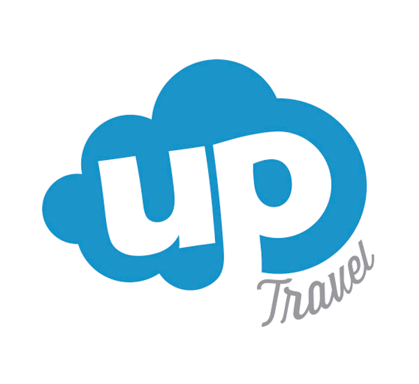
Up travel is a company that sells airline tickets.
Manya.pe team redesigned the logo of the company, using a typeface more friendly to users. The word UP was designed with contours similar to the cloud to achieve a more harmonious view.
3 Comments
Me likey. But...think about rounding the corners/edges of the word UP slightly. It might be more organic to the form of the cloud. Yeah, it's a nit-pick, but perhaps worth looking at.
One other thing: I'm not loving the "V" in "travel." Kinda looks like a "U." Consider disconnecting it from the "E." Something about it is awkward right now. In fact, you may want to refine the entire word "travel" as it seems like it could use a bit of finessing.
Otherwise, well done.
Agreed, MadManNYC
I intended to write the same as MadManNYC... Agreed!