ICT technasium
MatthewW | Wed, 01/29/2014 - 19:42
Brief from client
I made this for my béta project group at my school. Wanted to make something clean and simple. pls leave your comments
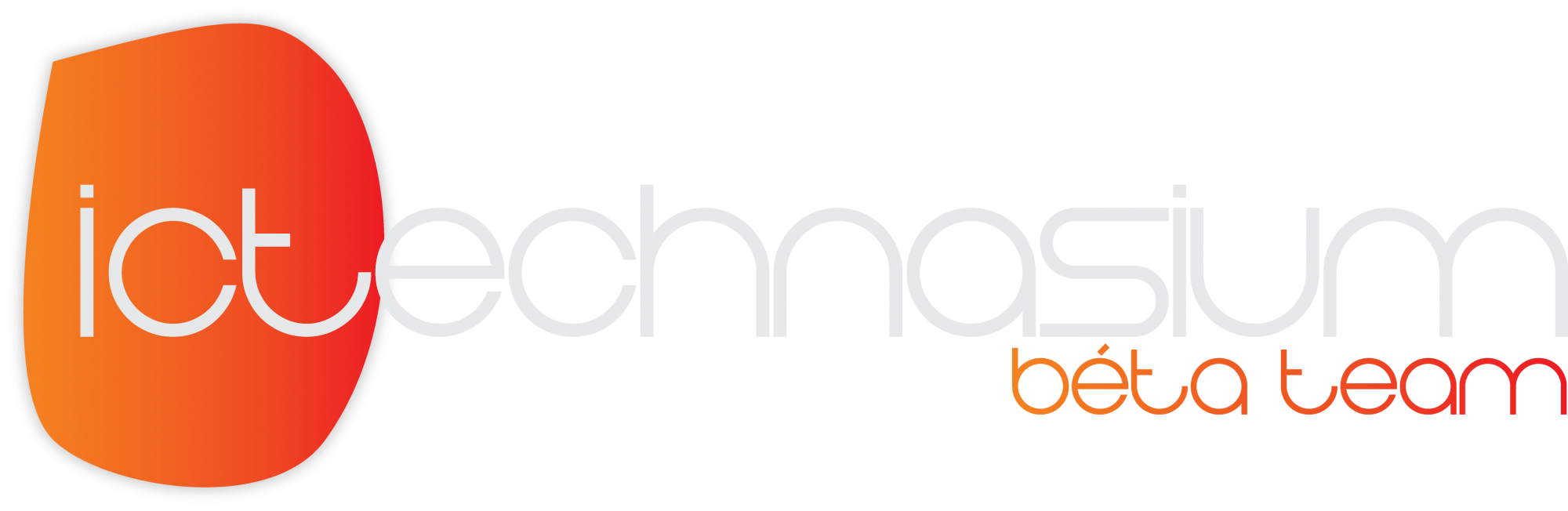
logo contains the name of our group, color combination totally at random.
14 Comments
I'm not sure what the orange oval is but the idea isnt bad but the typeface is killing me. Keep searching for a good typeface and either eliminate the symbol or think more about what it is.
Thinking about deleting the oval and put everything in the standard notepad font. That way i could make some sort of html-ish index, just to make clear we're coders
All right. It's hard to read. That 30% grey needs to be more black against that white. Or it has to be on different bgd. And again kerning is not putting equal tiny spaces between letters, it's something more than that. That orange spot means nothing. Other than that you are on the right track.
I agree about the oval and will rework it tomorrow(html-ish??? Idea explained above). The oval was a thing dat went wrong but looked pretty good, I'm new to designing so i can learn a lot here! Thanks
So much to learn! Just started with illustrator by yesterday.
Very good for a first attempt in Illustrator.
It's an amazing tool, but I would recommend you have a look at some logo inspiration gallery's and stick with pen and paper for a day.
Then get back on illustrator and I guarantee your designs will be better :)
this
...and that
Make the oval symbol and leave the source in graphite color, almost black. Try increasing the beta team name to see what happens.
I don't fully understand what you are trying to say
Simplifying: circular symbol, dark grey letter and big beta name team. Ok?
There is something I like. and that is the font "Beta" gives a futuristic feel!.
but the rest actually makes no sense
Good try for your first time in AI ;)!
i like typo logos, and your font i think is kinda technological, but i think your name in the logo looks a bit large no? is there a way to change for some letters only or maybe changing word's distributions, color in font is ok, but maybe you can try having some letters in dark grey and some in light grey instead of the gradient, same with "beta team"
symbol is strange, i don't understand what is it, i think a symbol should be something that tells you a bit about what the brand stands for, but that.. is it a D? or like an abstract random object?
Good effort.
I can see it is linked to technology, with the logo being quite simply styled, yet it seems too complicated in a way.the font just isnt right - too hard to read- and the spacing is just a leetle bit too close, looks very compressed from a distance.
colour scheme is ok, just the grey needs to be darker, as it will never work with white while its like it is.
symbol - what is it?!try to keep experemeting to create something that links, and is attractive and catchy
keep working!!good luck :-)