Brands of the World is the largest free library of downloadable vector logos, and a logo critique community. Search and download vector logos in AI, EPS, PDF, SVG, and CDR formats. If you have a logo that is not yet present in the library, we urge you to upload it. Thank you for your participation.
Version history
Version 1

- I
- S
- T
- C


2 Comments
Why, what, who?
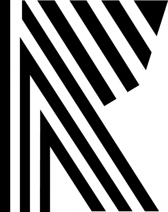
While I of course appreciate many great ideas and inspirations in terms of self-branding. For a lack of better words, I honestly have no clue what this logo is trying to represent. The closest that comes to mind is "Zebra stripes" or "A load of parallel lines trying to make something sensible."
The thing I think is the most difficult to visualize is the symbol's overall form. It was hard for me to know that it was an "R" because of the flattened top and angular front. I suspected that it was more like a "K"
Also while I noticed how black and white is a common thing going on, I think for this particular logo, it could help if some colors were used. A limited color pallete of 2 pantone colors would give us something a little more to visualize about. But for right now, your main focus should be the symbol in general. We can think about colors after we accomplished an effective logo design (unless of course you have some colors in mind, of which I say please include them).
If you are working on an identity, first be sure to ask "Who am I? What do I do? What symbolizes me?" After you ask yourself those questions, you will be better equipped to get your ideas on the paper in a more sensible manner. As of now, the logo is either too abstract to communicate an effective idea. Keep at it though, I'm curious as to how this one will turn out. I also suggest taking a look at www.logopond.com for some inspiration on some effective logo ideas. Best of luck! :3