EXPOKIDS
Brief from client
Image Expokids , compound annual event three : exhibition of innovative entrepreneurial projects , awards ceremony & closing ceremony of the program create our project and conference on entrepreneurship and innovation in school.
The CREATE Foundation is working on an initiative promoting entrepreneurial qualities from an early age through education. Entrepreneurship education and learning by doing favors empowerment and freedom of responsible choice . We believe in the power of teamwork and the professor as a driver of learning. We have designed a program for the promotion of values, skills and entrepreneurial attitudes since 5th or 6th grade . It is taught in school, during school hours , through teachers and visits of entrepreneurs and professionals. Based on a methodology that promotes experiential learning through self-discovery. Children go through all stages of project development , from exploration and discovery of a need to display and sell your product or service. Students create in the classroom in a real project team throughout the entire course . All this culminates in EXPOKIDS , where projects are presented to the public. It is done in a morning , children ride a booth per company and promote your project
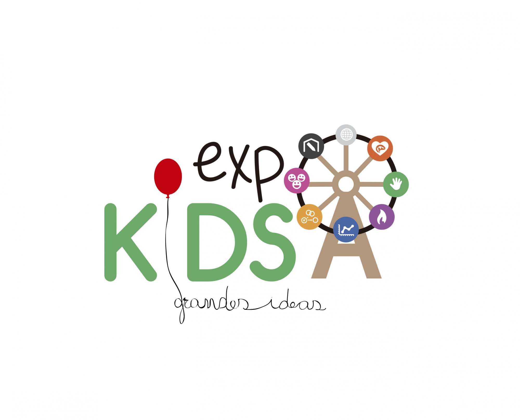
The pillars of the program are reflected in the wheel.
2 Comments
You've chucked everything at this and it all stuck by the looks of it.
There's about 11 logos going on here, but that's not it's biggest problem.
The fact that it reads as EXP KDSA Grandes Ideas is something that needs to be addressed.
I realise you want to use the pillars of the program to explain the business, but it simply doesn't do that, it does the opposite and makes it look confused and messy. It's like Domino's Pizza adding all the toppings you can choose on their logo to explain that they do more than just a margherita. The symbols (along with the text at the bottom) will not be legible when printed small.
It's a nice palette, but you should never really use more than 3 colours for a logo, unless there's a damn good reason.
Ideally, I would start again, but a quick fix would be to delete the wheel, change the fonts and only use 2 max. Then use the balloon as the dot of the 'i', but you can't have a string for the main body of the 'i'.
I would play around with the iD, as it kind of makes a smiley face.
I agree with my man Jon. This is unfortunately a mess. Unreadable and over complicated are your main problem here.
Scratch this one and start fresh.