Hannah's Furniture
jmarsh8923 | Mon, 07/21/2014 - 23:43
Brief from client
Im not good at graphic design but I find it fun. I made this logo for my girlfriend for her furniture business. Can anyone give ways to improve it or next steps to make it more unique
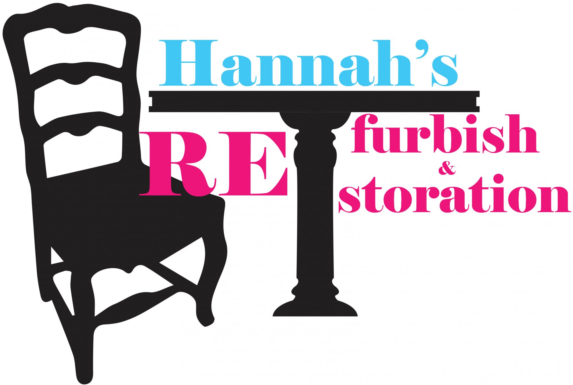
The idea behind the logo was the she does refurbishing and restoration of antique furniture. I was trying to sit the "RE" on the chair. but that doesn't come through to well. Any suggestions on ways to improve it.
3 Comments
Try this: take off the text, does it still say ( re furbish and restoration)? No!
Look for a different idea, and consider trying out different fonts.
What tools are used in refurbishment? Maybe you can try that in your logo.
If you are still go for chair & table in this large scale, choose either one of them, not both. Otherwise they should be small and symbolic.
I'm not sure showing bandage on the furniture leg can do the job, you may try. Hope this help.
Well i do think you got a good idea, but, those color are killing it; i mean, i know these are "in" right know (or at least it is what people think) but it doesnt apply in your case. :/