Brief from client
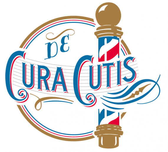
Logo for a radio broadcast that talk about hairs

I drawed a logo in vintage and classic style cause the client wanted something with a taste of elegance.
The barber pole was an explicit request of the customer.
The client was very satisfied.

6 Comments
I really like it. The pole, though, need a little work at the brown ends, try and make them a bit simpler and symmetric. Now it looks like they've been traced.
I preferred kept it a little "not perfect" cause make it more vintage but I'll try to make a clean version.
Thanks for the advice.
Ok, I get that, you want it more original. But keep that imperfection in the symmetry not in the details, it just look like it's cheep work. Maybe play a bit with the white reflections on thee pole, or with the wavy lines, that by the way, are all bellow the type, and just one above the "de"
We need to print it on textiles so we can't work so in detail.
it looks like an image trace to me other than that it looks sharp, however the D from DE looks weird tho, and i'm not sure i like the colors.
It looks great, I really like, would detail over the mast at the top of the sphere is a bit deformed, I think it would be more aesthetic if kept perfectly round. but excellent work.
sorry if there are things you do not understand, I do not speak English.