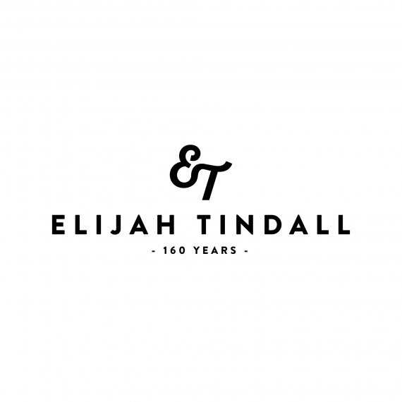
Elijah Tindell Rebrand
Brief from client
Rebrand a company with 160 years heritage. Corporate colours must stay the same.

I have the privilege of rebranding a hardware company with 160 years heritage. They produce gate fittings, chains, ropes and general tools & hardware. There is also a furniture company which has been going for 15 years, as a sub division. I tried many different ideas, incoporating some of their main products into the logo, and ended up here with a typographical solution. I was also torn as to whether I create two separate logos, or one all encompassing logo... I created the mark by adapting an existing font, although i'd have liked to have freehanded it, but I don't have a graphics tablet as of yet.. getting one SOON. I'll be presenting a version of this solution to my clients on Friday. I feel privileged to be able to work on such a project and feel as if in many ways I was simply a conduit to a style and solution which had to be.. I also get to be a bit retro and hipster with the minimum of pretense. These guys are 160 years old!! I do feel that the mark needs tweaking, but i'm happy at this stage, and as always welcome your thoughts, suggestions and critique. :) p.s I had to change the name of the company slightly, as I don't want to out SEO their website etc etc.


14 Comments
Slight variation...
Here's a version displaying the use of specified corporate colours... which i'm not a massive fan of, but hey.
Jon, thank you for a very detail information on what that company does. Something I need to learn doing it... My first question is : is this an anniversary logo and you must include " 160 years " or you simply did it on your own to recognize that? Second question is : a version with blue/yellow must be presented no matter what, because they like it? Back to your proposal - I do like a font. On a symbol I favor one without a roundel, as I prefer logos that way. Love your idea of merging two letters together,but for some reason would like to see one more version when a lower part of " E " curls inward and the same goes for " T " in upper portion and then merge the two curls together. Please, check a spacing between " A " and " H " and " D " and " E ". Also, 160 years could be slightly bigger. Good work.
It is simple, elegant and reflects what is working good friend, blessings
i just love it
This is a really cool, nice and elegant logo. Very well done.
Now, my only concern is that when I see it, I don't think about a hardware store. It may be actually too elegant and sophisticated for this kind of business. Maybe if you'd brought some slight distressing and dirt, it would do the trick.
But globally, this by far the best logo you posted! Great job!
WOW. Thank you all for the feedback - it means a lot. Sorry for the late reply, but I've been working in-house for the company.
This was the first logo work that i've done for about a year and I worked hard on research and sketching. I'm very happy with the result.
Charlie. I'm very honoured that you like it and feel that it's the best that I've posted. I agree hehe =)
That said....
I was called into a meeting to present 'intermediate progress' i.e to check if i'm barking up the wrong tree completely. The main type was liked but the 'ET' mark was pretty much rejected on the grounds that it's 'too' traditional and not modern or progressive enough. Don't get me wrong, this isn't a hardware store. The history goes back to Victorian blacksmith work to the present and they're expanding as a business into unrelated realms.. i.e furniture and beyond.
I felt that this logo could reflect the heritage and still be contemporary enough for the future and the ventures that it may bring. I still hold the arrogant conviction that this is the right visual solution for them.
I don't know where i'm going to take it, but i'll be sure to post the result, although at this moment in time, I feel a bit like a performing monkey... :/
We all dance the monkey dance from time to time.
I had a professor tell me, way back in the olden times, that if 10% of your work is good enough for your portfolio the you are doing well. I've never kept track of the actual math but that advice has always helped me not obsess over bad client decisions and move on to better quality jobs faster.
10%.. I like that percentage. Thanks.
Awe, I liked it because it was traditional and a bit modern.
Some clients just need to accept the fact that you are amazing. Silly things.
Hmmm. My sarcas-o-meter is twitching. Not sure if it's just residual seismic activity though. :o
Oh if I was being a sarcastic ass... trust me, you would know.
I really did like this for those reasons!
I like that combination made with the ET is nice.
Not much to add, I can only say it has done a good job here :)
I like it best without the circle.