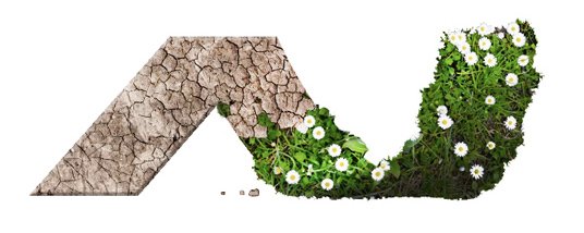
ActiveCast Logo Rendering
bobucks | Tue, 08/11/2015 - 10:38
Brief from client
The ActiveCast service gives life to products. The focus is on the vision of taking something flat and giving it more dimensions combined with the idea of giving something life.

There is an idea of a simple ribbon that is flat initially and then brought out into space from left to right, the flat "A" of "ActiveCast" is shown flowing into a suggested "C" with a curve extending into a three dimensional space.
I'm thinking about what kind of treatments will compliment what the ActiveCast service is about. In the rendering, the "A" starts as cracked barren earth that leads to verdant vitality showing the progression from something dead to alive. Any thoughts would be greatly appreciated.


9 Comments
This can't work as a logo, I'm afraid. It looks like an amazing advertisement, but logos should be only a few colors so it can be properly used across all types of media, such as screenprint, embroidery, etc.
This is a really good advertisement image to use. It isn't a logo though. Very nice to look at though.
I think you should use this in an advertisement, but you need to sort out your C first to make a simple clean logo for use in all media.
Thanks, for reference I have the base symbol. I realize I'm just asking for feedback on the symbolic part of the logo, regardless of color or font.
Logo design 101: no pixel based elements in you logo. So no photograph or PSD textures! A logo should be 100% vector so it can be reduced and blown up in size without losing anything visual quality.
And as Joshuasm13 said, there's no C to be seen in this logo.
I see faces , too . Bobucks, thanks for a black/ white diagrams - they are more clearly for folks who don't see letters and shapes on your original display with dry earth and grass. I dig your idea of A and C - it needs a lot of polish to be more visible to a general viewer. I will not rate this one, as it is not finish yet. Would be interesting to see a progress on this one.
AJ landscaping ?
That's what I saw =O\
At a very first glance - it is nothing more but a stylized N .
Man, it is really hard for me to see the C in this logo, but I just love it.
It would be an amazing logo for a clothing company, who ever contracted you is a lucky person. Way to go on this. This is purely a praise post, no critique here. Just thought my opinion needed to be shared.
It is just so stylish and progressive, I wish I would have made it.
I just can't see the A or C. As for the texture i really don't think it's a good idea to use a picture, also the trim you did looks very choppy ! :S If you really wanna continue using this you should use a clipping mask or refine the edges at least