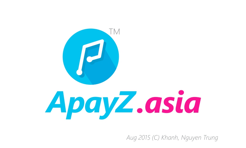
ApayZ.asia
Nguyen Khanh Trung | Tue, 08/18/2015 - 11:21
Brief from client
Concept & Designed by Khánh, Nguyễn Trung. All Rights Reserved. (C) Aug 2015
The concept comes from Payment on the go.
ApayZ is the brand name.
The logo takes first letter P for payment word. The P letter to line & point describes "point on road, pay on road". From Point to Point pay to pay.
The primary color of logo means fresh, fast & young. This for young payment generation. They are always outside street.
@@
7 Comments
Care to give us any context and background about these logos? It would be helpful (and polite) for us to give you some feedback.
What happening? Shawadi?
We'd like to know what the company is about, some choices behind your design, etc.
We'd like to know what kind of business this is and why you made the same logo 3 times with a different name and symbol.
Explain what the logo is for.
Freetranslation.com: Giải thích cái logo là cho
No, I don't speak Vietnamese
Get what ever you want from «A to Z» and «PAY» ?
ApayZ is a Brand Name. The logo developing base on Payment on road.
A,Z does'nt mean from A to Z @@