cr3ativ7
kalamarko | Sat, 05/14/2016 - 18:12
Brief from client
The company name is cr3ativ7.
So they want minimalist, creative and simple logo, with just one or teo colors
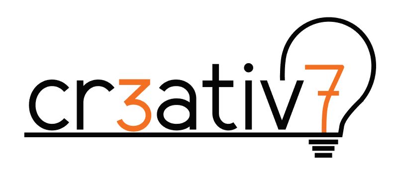
In their old logo they had element of light bulb and they wanted to keep it.
So, i created simple logo, just with text and light bulb with 7 in it instead of tungsten (simplified shape) :)
Colors are not determinate yet.
I know it can be better so I would like some critique :)
Thank you.
3 Comments
Sorry, but this is still not working for me. This logo isn't minimalist at all. Since the basic idea hasn't changed since the first version, no cosmetic change will improve it.
Again, the light bulb thing is the oldest trick in the book as it already was 10 years ago. Same goes with the 3 replacing the E. It might have been cool in 2004 but not in 2016.
Do some more research. Check what you can find on Pinterest and some one the gazillion graphic design website on minimalist logos. Research and inspiration are key to fuel your creativity. Then, let go of your mouse and sketch a few dozen or even hundred ideas. Don't create straight on the computer.
Keep it up!
What was changed besides the colors? My comments on the lightbulb still stands.
It's really unfortunate that a company established their name as 1337 sp33k. But what can ya do...
Hi, is the first time i give a reply, i hope it helps you. I've been reading the comments of the other designers, in this and the other post, and i believe they are accurate. I think that you are trapped with this idea, and is not a really bad idea giving the name of the company.
I believe that you have to take some time, get away from this project for a while, if you can, and take it again with new fresh air. Look for typographies, there are a lot a resources online to buy, test or download free licensed typographies.
Your logo is mainly typo, so i think your success will be in finding the right one.
For the name and lightbulb, you really have a hard work ahead, but look for inspiration, there are tons of different lightbulbs, and, if you as a designer think that is not good to keep it you have to say and give to your client a better solution.
Look for other companies that do the same, see how they represent them self, try to figure out what they have in common and why, and how you can make something different from them too, but always with your client in mind and what it does.
Hope it helps, and keep up!