Hi i am seeking some constructive feedback for some variations of some logo designs.
mauraust | Fri, 07/08/2016 - 07:33
Brief from client
The Company is called 8+ and is a social networking platform for attractive people
Our brand persona is fun, flirty, exclusive, cheeky and slightly mischievous
Our target market is
Primary Flow-On Market
● 17-20 year old, female, single
● Interests include pop culture, celebrities, fame, beauty
● Positioned as the cool club, an elitist platform that not only delivers status
Secondary Market
● 18-25 year old, males, single
● Interests include fitness, health, nutrition, sports, music, fashion
11 Comments
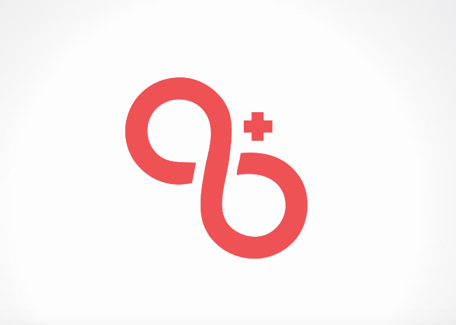
Varation 1
Variation 2
Variation 3
Variation 4
Variation 5
Versions 4 and 5 are identical with an exception of a different color scheme but much better than other three versions. I like the general idea behind but a final result is not there, yet. Also, fine tuning needs to be perform - so, a plus looks plus and not multiple symbol or " X ". I can see a continuation on version 4, but would start seeking other ideas, too.
The main problem is that since you tipped the symbol on the left, it doesn't look like an 8 anymore but more like an infinity sign.
Keep things simple and put it straight up.
Would it look more like an 8 tilted to the right? Just an idea to consider.
Waffles, by doing so ( your advice on tilting ) a plus would become less of a plus, which is already took place and more of an " x ".
If the 8 was tilted the same amount in the other direction, the plus would still be a plus. Basically mirroring it.
I wasn't sure if it would look more like an 8 or not, so I quickly flipped it.
Not sure that it looks less like infinity and more like 8 though...
Maybe less tilting?
On a left version plus is a plus, but on a right one is a multiple symbol or X.