7 VALUES
leebiggadike | Tue, 10/09/2012 - 17:26
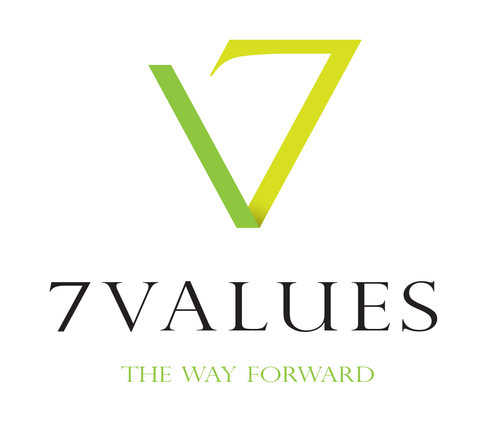
Brief from client
Sub Brand for a school which is implementing 7 non academic values to help pupils become better people. i.e. teamwork, confidence etc
Sub Brand for a school which is implementing 7 non academic values to help pupils become better people. i.e. teamwork, confidence etc
5 Comments
I like the logo maybe make the lines thicker?
But i feel as if i have seen this before? or something very similar?
The tag line i would change to a simpler font. and adjust the colors of the light green to be less vibrant.
Yeah I kinda want to see it thicker too- along with the font. Or maybe I'm just not a fan of the font in general- it's so spaced out. Maybe too spaced out? I really like the idea of the V and the 7 though- it works. One thing I might mention- the lighter colored green is kind of bright and it MIGHT not print that brightly. But I do like the idea of a darker green and a lighter green. And maybe make the subtext a little bigger/bolder and closer to the main font.
Overall, I really like this idea a lot- I like where you're going. But I'd up the thickness of the main symbol, maybe play around with a few other (more bold) fonts and increase the size of the subtext and move it up a bit! (Or just condense the whole thing so it's not so spaced out.)
gostei bem definido, apenas as palavras no final parecem sumir por conta da espessura da fonte com a cor verde muito clara, vai que da certo pro cliente.
agora eu vejo que SARAQROXY fez boas colocações com a critica apesar de querer mudar quase tudo em seu trabalho, tá de parabéns!
well done. but I agree withh all the other critiques.
Very nice, only the thickness as mentioned above. maybe give another colour to the 7 in the typography or make it a little bit larger. So you can see better that it is a number.