Breadsticks N Bites
Brief from client
A quick serve mall-type Italian food restaurant is adding a baked snack section to one of it's stores. The name of this section is Breadsticks 'n' Bites.
The client wants the logo to be fun, appealing to children and immediately memorable. Examples he gave were Hot Dog on a Stick and Wetzel's Pretzels. He also wanted two colors in the logo that would be echoed through the decoration of the store and all paper products and advertising. Much like the way McDonalds utilises yellow & red.
This is one of my first attempts at logo design and I would really value any critique or suggestions.
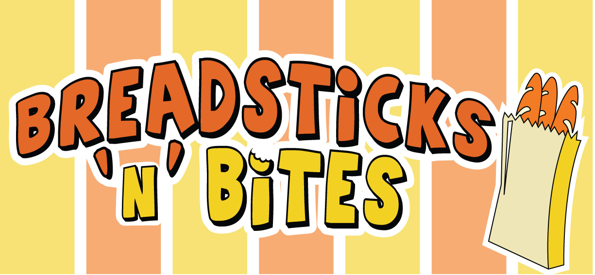
Updated version after advice. I'm not too happy with the breadsticks in the bag, I feel like I could have a more creative and interesting symbol/icon there but I have been staring at this for too long today to continue looking at it objectively!
5 Comments
the bag is too illustrative and you are right not to be happy with this. Take a bread out of the bag , and put it in the place of an "i" . Keep the detail and give to it the same effects of the font.
The feeling is ok, but the idea isn't very original. Also the typeface is too relaxed. Not feeling the italian brand here. Try red and green too.
My client does not want a sterotypical Italian look. The Breadsticks and Bites concept will be an addition to his already very Italian branded pizza & pasta quick serve restaurants. This is why I have not used the typical Italian colors.
My client wants something akin to Wetzels Pretzels type log style. If that gives you an idea why I have gone in this directions.
Thank you for your comments!
experiment with the fonts and play around with some bread shapes and styles.
You should be doing 4-5 different designs with different elements. here's a very quick example with a few spare minutes of a food style font. ITS A FUN LOGO SO HAVE FUN WITH IT
Hehe, I agree with what you said about the bag o' breadsticks- although I don't dislike them for what they are, I just don't like how cartoony they are, nor do I like how they put the text off center. I recall you mentioning that the client didn't want one of the letters to be replaced by a breadstick, so what about doing something like carl's example above but keep the 'bite' out of the i, and keep your font too! (Although I do like that Carl took the white stripes out of the background- maybe try that on yours!?)
I can tell that you're really trying- it's getting better and better!