Brands of the World is the largest free library of downloadable vector logos, and a logo critique community. Search and download vector logos in AI, EPS, PDF, SVG, and CDR formats. If you have a logo that is not yet present in the library, we urge you to upload it. Thank you for your participation.
Version history
Version 1

- I
- S
- T
- C


27 Comments
I think it works!
Great!! you can add a symbol… but I like it
Once my boss told me to make a banner for his page, I asked him about how he wants it and he told me "impress me!' my first neuronal answer was in the area with "screw you , I'm going home"....If this is your case I wish you luck, those guys are self sufficient and never pleased. The logo looks good the typography is elegant and beautifull, it asks for a symbol.
Looks great! Hmm maybe for a symbol something EXTREMELY subtle. Like a coffee bean or some squiggly lines? The huge gap in your last "e" could be a place to put the symbol. Below is my rough idea of what I was talking about. Note: In this way they look like beans but if you look a little harder it also looks like steam lines over a cup!
could make the negative space in the "o" into a coffee bean!
Ah very true, another solution!
Thanks guys.Means that im moving in good road!!!
Just out for curiosity :D How much guys you think this result is valued?
LOVE THE FONT AND LOGO MAYBE MAKE THE "O" INTO A COFFEE BEAN!
Sorry for caps lock ;) Lol
Thanks.Im realy happy to hear that you love it
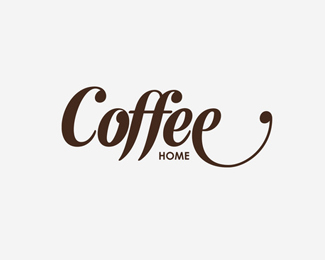
Letter "O" it ment to look like a coffee bean.Nice that you spot it Monito ;)
Indeed, Maybe and it is juts a suggestion: the coffee's steam above last e
I agree with this!
nice strong typography and word mark. I like the idea of adding steam lines above. I'd keep them simple and smaller though. Nice work.
I think that it's looks better, very fresh and complete, i agree with this version.
I agree with monito!
I also agree with the masses that you make the "o" into a bean and/or 3 squiggly lines above the last "e" to represent steam. Good job with this and you're just about there!
Nice one. I don't see why you woud need a symbol, you can go without a symbol I think. What I don't understand is the thing you did to the letter e in the end. Does it have a purpose other than making the logo more unique? Maybe playing with the letter C would make more sense from a typographical point of view and would not break the ballance.
Letter e represenrs coffee cup shape. Wich create logo unique and stand out of competitors.It's like a signature ;)
Hi, i love the font. i have tried something here. have a look. i just feel that typo is nice but as a logo idea there is not much happening, so if you make a cup out of the two 'e' facing each other i guess it looks better. You can work on making the type organic. Hope this helps :)
I like its simplicity... so visible. It's how a brand should start. I'd leave it like that.
What if you let the "Coffee" letters the same size, and change the colour and size of "Home"? I think it would be nice :)
Classic, change the type, is too used.
Ignore what Minona said. Moving on.
:D
It looks fine, and i agree with most comments. Just that top of the first "f" bothers me because it has no ball... I also like the steam idea from Marcelo.
Thanks everybody for his Idea.The client he loved standart version,so we stick with that ;)