Brands of the World is the largest free library of downloadable vector logos, and a logo critique community. Search and download vector logos in AI, EPS, PDF, SVG, and CDR formats. If you have a logo that is not yet present in the library, we urge you to upload it. Thank you for your participation.
Version history
Version 1

- I
- S
- T
- C


6 Comments
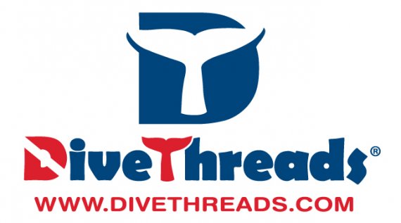
Ok.. Looks nice except the "D" in the main text. It is too much. Except that it's very nice.
Thanks for your input!
As far as the "D" goes, are you talking about the diver-down flag motif D in DiveThreads? It's meant to resemble that flag...would you have a suggestion?
There are good ideas here. Problem is, there are too many of them. The symbol, the D and the T... You need to simplify.
Keep the fontwork simple and you should be ok.
What if we used the widget and the logo name line separately? Would that look better?
As all have said, loose the detail on the text. It takes away from your symbol. The type itself is a nice choice.
Shawali is onto something. How would it be if you got rid of the dive flag motif in the D and just let the whale tail carry the idea of "underwater?" You've already got the word "Dive" in Dive Threads. You don't need the second whale tail in the type, either. Here, I think that "less" is definitely "more." The bid D with the tail is strong enough of a mark without adding illustrative elements to the typography.