EPIC (Economia Per I Cittadini)
Brief from client
Logo for no profit association that represent the values of a new kind of economy that gives a new pulse to the italian society and gives back to the people his rights.
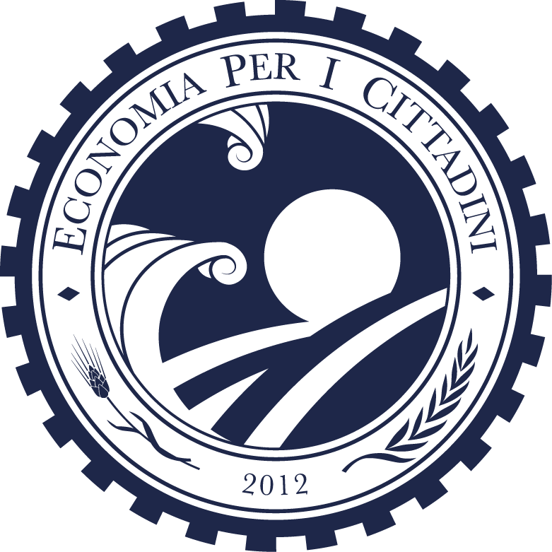
EPIC logo was inspired by the Obama logo.
The main elements are:
1) the sun (that back again)
2) the sea (that brings a new era)
3) the wheat (job)
4) the laurel (culture, arts and reason)
5) the gear (an engine that will start the new movement)
In the center of the logo on the background, behind the sea, rise up the sun that brings a new day. In front, a couple of waves crash on left making two billows designed in phoenician and greek style.
Theese elements represent a new age.
On the top appears the name of the association "Economia per i cittadini" (litteral translation - Economy for the citizen).
On the bottom we can see one ear of wheat on the left that represents the industry; and a laurel branch on the right that represent the culture, the arts and the light of the reason.
Outside a kind of a gear that represent an engine that gives motion to a new era.
All the elements are designed in a classical style very similar to the old italian coins (lira) design - very close to the roman, latin and greek style because the idea that must come out is that the mediterranean people needs to back to his origin for find again their best.
7 Comments
I like it ,maybe some elements like the wheat and laurel will be blury if you reduce the logo, maybe try defining a little bit the sun it looks a little like a strange Q mirrored. That´s all the obsevations I have for you, everything else looks wonderful to me
Thank you for your comments. For the small sizes I designed some decreasing versions.
I like it and i like the idea of making smaller versions for smaller print. This logo is well done in all aspects. You can give the signal for the sennet :D.
Thank your for your comment. Please let me know what you mean with "sennet" :-)
to cry from the house-tops....a signal that sounds to announce something or someone important is about to come or to begin.
Well, I´m please to see that you have thought of the reduction, the smallest one it´s pretty cute, I´ll take the little shape of the wave in the top of the smallest one just to leave it a little bit more cleaner since you are taking elements off for the legibility of the smaller sizes!
Good suggestion!