Brands of the World is the largest free library of downloadable vector logos, and a logo critique community. Search and download vector logos in AI, EPS, PDF, SVG, and CDR formats. If you have a logo that is not yet present in the library, we urge you to upload it. Thank you for your participation.
Version history
Version 1

- I
- S
- T
- C


2 Comments
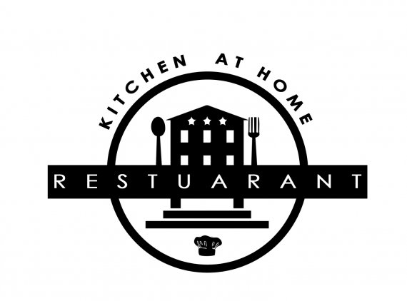
Right off the bat, there's a giant typo right in the middle of your logo. You might want to fix that pretty quickly.
This isn't looking too bad but you need to simplify things a little. There are way too many elements that just clutter the whole thing. If I were you, I'd remove the chef hat, the fork and the spoon. The building looks a bit too basic, but it may be what the the restaurant actually looks like.
You also need to make the restaurant's name "Kitchen at home" more prominent. "Restaurant" should be the subtext. The restaurant name is what makes it unique. I like the font you picked for "Kitchen at Home", but the one for "restaurant" is way too basic and bland.
Now, this isn't looking like a logo for a classy restaurant. It got that hipsterish trendy style that I would associate with a bagel joint or a food truck.
Keep it up!
EDIT: I don't know if you plan to apply some colors, but in black, this logo looks a bit gloomy and dark, like some funeral home.
I'm confuse, is it a restaurant or catering service ?
Be careful with the space between your «N» and «A»,
they look bigger on a circle (you may have two space too).
=O)