Brands of the World is the largest free library of downloadable vector logos, and a logo critique community. Search and download vector logos in AI, EPS, PDF, SVG, and CDR formats. If you have a logo that is not yet present in the library, we urge you to upload it. Thank you for your participation.
Version history
Version 1

- I
- S
- T
- C


14 Comments
I APPROVE OF THIS LOGO.
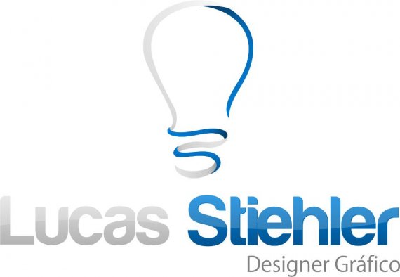
maybe darken lucas
I agree with monito, once again... But I dont know... Is it the kerning ok???
Agree with monito about lucas, Kerning in "Stiehler" between "ie" seems to have a problem. The logo is beautiful.
Looks good, but we've seen at least 50 lightbulb logo's in the past 3 months. Hope it works for you.
Do you have any problems with... lightbulb????? hmm??? ;)
It looks good, but I have to agree with 2423media - it is a little common.
While I do agree that the light bulb thing is seen a LOT lately, I do think it's a nicely done logo. I would also fix the kerning problems that were mentioned above, and I'd make the light gray color quite a bit darker, it nearly disappears here! But if a light bulb is what you want, then the symbol is nice!
agreeing with the above about kerning.. Its a great logo with great potential. If you could just get those curves perfect and maybe thicken the lines a little more and add some depth you would have a winner. great effort! see attached design and you will see what i mean about keeping all lines even and slightly thicker,
wowwwwwwwwwwww!!!!!!
reallly , woooooowww!
wicked!
The logo look really awesome, but i think it lost a little bit of it`s moviment and got too serious, that isn`t what i`m looking for. But i loved the colors, really really beautifull. I`m going to use them. Thank you for your help. =D
Awesome man! You got it!
Great job, it looks awesome (: Can't wait to see the next version