MadBoxx TV
Gigafrost | Thu, 09/06/2012 - 14:16
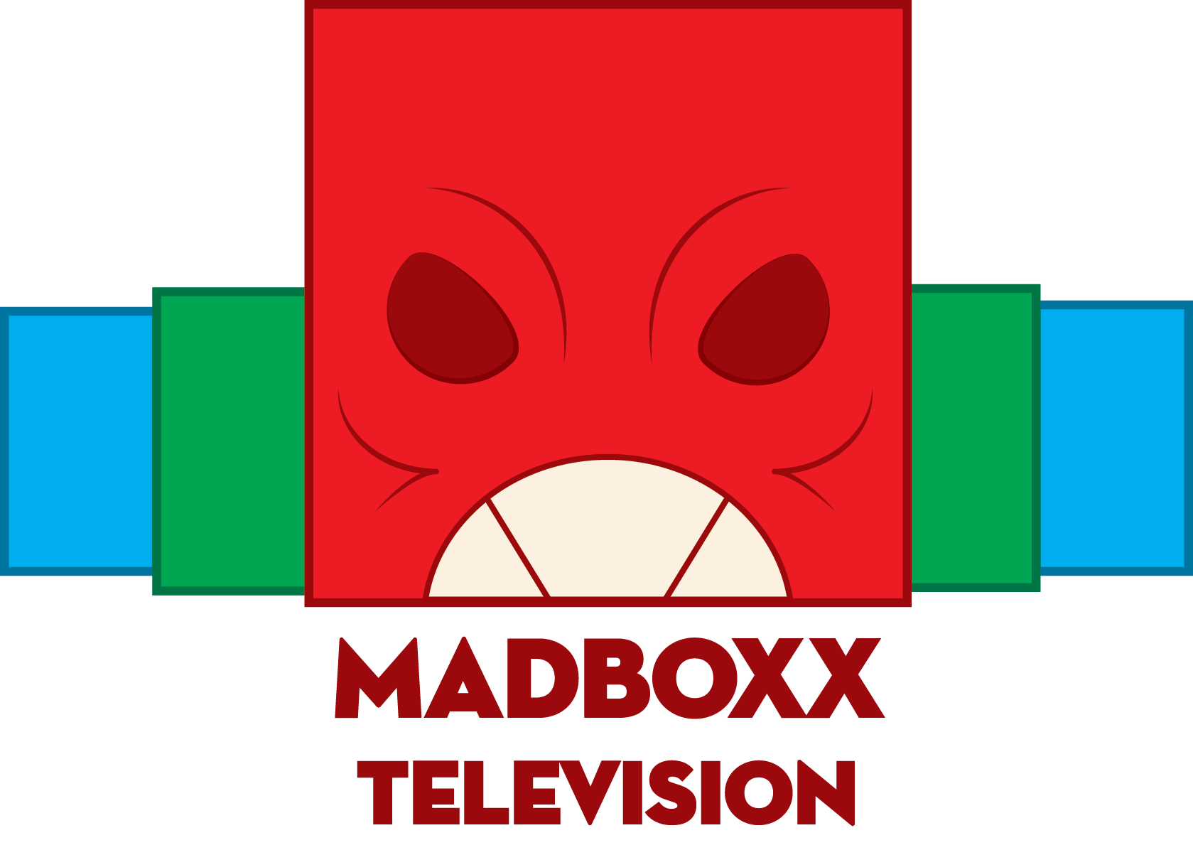
Brief from client
Create a television channel that represents Horror, action, scifi, and drama. Something aggressive but at the same time in respect to something "TVish". Use RGB colors.
8 Comments
Too harsh for the moment. Evolve the graphics and you would get something less detailed but still communicative.
"Too harsh for the moment", "Evolve the graphics" Can you please explain in detail what you mean?
The font is nice, I like the typography. The graphic part is poor on the other hand. Imagine this stuff in the top left corner of the screen and maybe you'll get why. The monster face in the middle contains thin lines that will not work in small sizes.You got the "agressive" but it's far from the "TVish". You will need something a lot simpler than this and I don't think you have to stick to showing TV screens just because it's the logo of a TV channel. Do something that would work in one color black too and you will get closer to the solution. Do a search on TV channel logos in google and you will get plenty of great inspiration.
Excellent critique, will definitely take note of those flaws in the design.
I really like the font. The color of the red is definitely angry, but the blue and green are unnecessary - just because they say to design it in RGB doesn't, necessarily, mean they WANT all three colors.
Also, as noted in the critiques above, it is too detailed and too far from a ghostable logo for the corner of your TV screen (think the NBC peacock or the CBS eye - simply, yet recognizable).
Additionally, I think it is important to note that the channel lists more than just horror or 'angry' so you don't want to alienate the audience too much with the focus on the one genre.
This is a perfect time in the history of television channel/brand evolution for you to take a look at Lifetime network's BACKLASH on their new logo. Read through some of the comments on their re-branding to find out what viewers think about the logo that will, ultimately, emblazon their screen.
i can not actually view anything? is it just me?
I have more critiques open but this one is blank? lol*
^^^ HAHA found out my "filter" is blocking this for some reason *
Lol it seems like my logo was too angry for the filter? XD
i dont like this at all. i guess you should take a new blank paper and start afresh new scribbles.