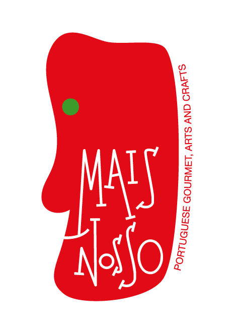
mais nosso
fernandolucas | Mon, 07/16/2012 - 17:56
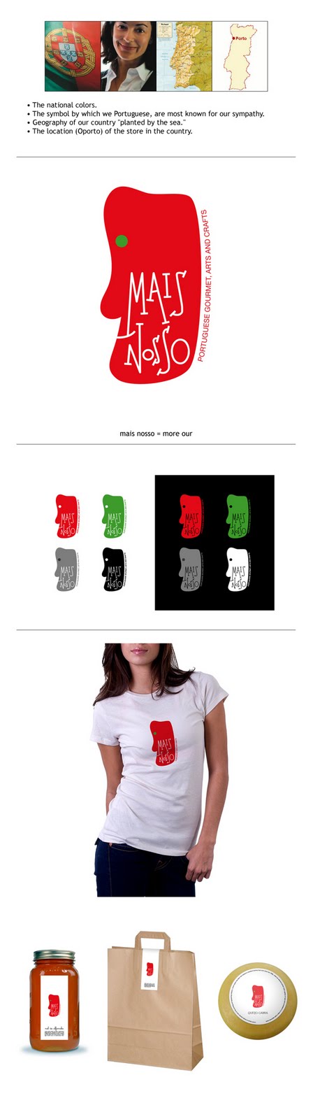
Brief from client
A logo for traditional gastronomic products of northern Portugal, for a store in downtown of Oporto.
· The national colors.
· The symbol by which we Portuguese, we are MORE known, the sympathy.
· Geography of OUR country "planted by the sea."
· The location (Oporto) Store in the country.
http://3.bp.blogspot.com/-dsys9wtvCWY/TjFAVNRf9uI/AAAAAAAACfw/u6Md4FNGy1...
7 Comments
I admit I'm not 100% sold on the vertical text (then again, I'm never sold when it comes to vertical text) but all in all I LOVE this! It's clean, it's a little Picasso-y, the font works perfectly, yada yada yada- I looooooove it!
Thank you for posting something that -right out of the box- doesn't hurt our eyes!!! :D
I get that you want to use the green to show the Portuguese colours, but the green you used is so insignificant that no one would know it's intent. I'd lose the green altogether and make the eye white. The green does not look good butted up against the red. If you REALLY want to keep it, then you may consider a 2pt-4pt white outline on the green to separate the colours.
Otherwise, i'm liking everything else about this!
Congratulations!!!!
i really like the idea, it is just like a Saul Bass creation!
ولكنني لا تزال تريد أن تعرف لماذا أذنيك على النار.
And why would my ears burn? :)
making off :)