Personal logo - media designer
2m4 | Tue, 04/01/2014 - 17:24
Brief from client
My name is John van der Wens. I’m a mediavormgever. That's dutch for media designer. My customers know me personal. I need a simple, creative and personal logo for my website and letters. My main work is animation but I also do video, web design and graphic design.
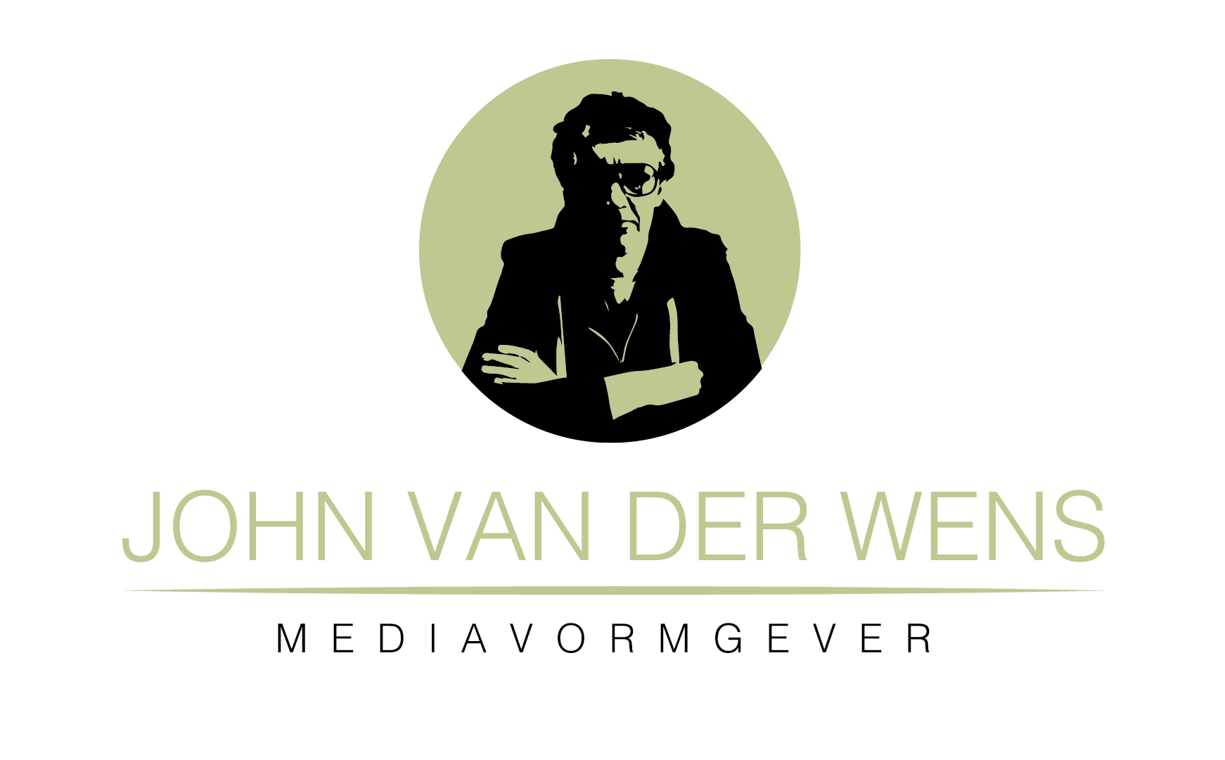
I'm thinking of using different colors for this logo. Maybe I can also use different kind of vector portraits of myself through my website. What do you think so far?
8 Comments
I would start by simplifying your portrait. Think of small applications where your logo would be shown, such as a business card. You are going to lose a lot of that detail when you shrink the image that small, especially lines like the strings of your sweatshirt and the rims of your glasses.
It's not bad for being just helvetica on the typography, but I think your kerning on the "MEDIAVORMGEVER" is a bit too spaced.
Hope that helps!
Maybe get rid of the portrait altogether. If they know you personally, why do they need to see a picture of you?
To confirm and reassure it's me they are dealing with. Not some guy of Daftpunk with a helmet :-)
Alexi moves fast enough to justify the helmet and I, for one, support him. ;-)
Lol
Nice, +1
But good point! Thanks.
I think as an illustration this is very good but I do think it will present you problems in many applications. I think it's worth keeping as part of your branding but as your mainstay logo I think you need to explore more. I like the colors you have selected. Maybe develop a symbol that says you without literally being you? Depending on how you go from there you may need to track your text tighter so it's not to long horizontally. In a limited horizontal display your name and subtext will be very small. Interested to see where you go with this.