Brands of the World is the largest free library of downloadable vector logos, and a logo critique community. Search and download vector logos in AI, EPS, PDF, SVG, and CDR formats. If you have a logo that is not yet present in the library, we urge you to upload it. Thank you for your participation.
portalpr1
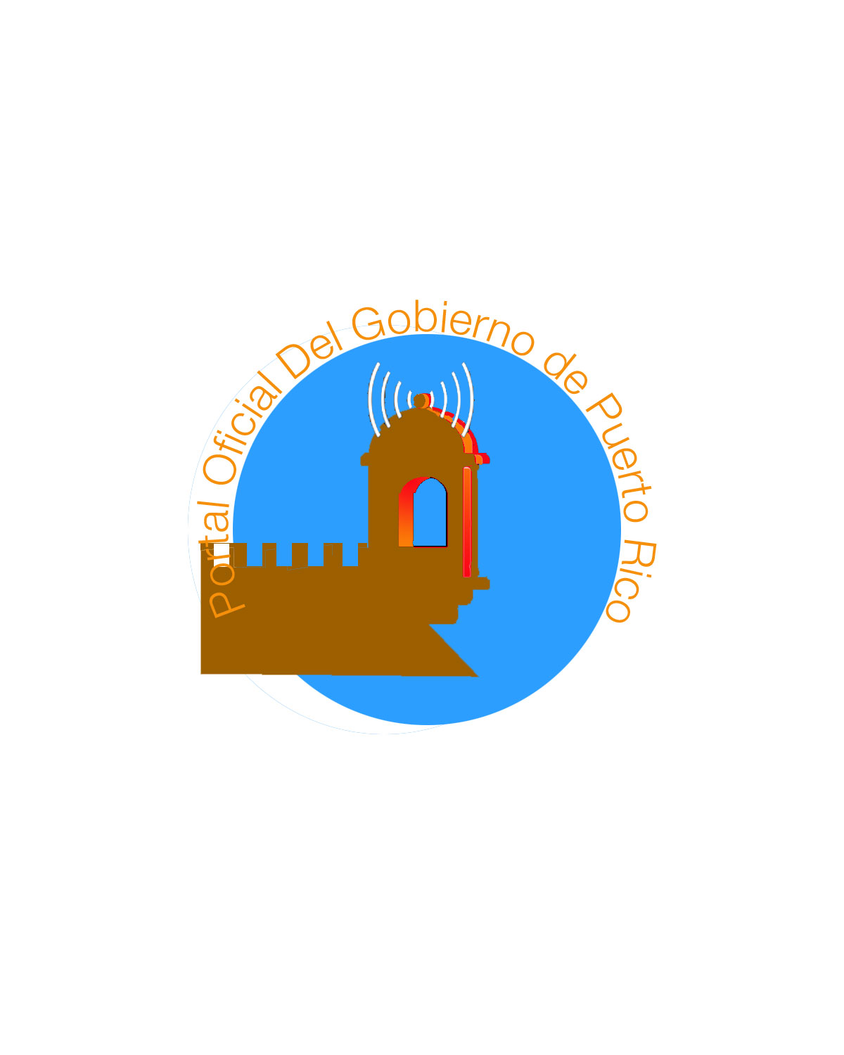
astramaria | Wed, 07/18/2012 - 06:43
Brief from client
hope this is closer
trying to choose colors that are easier on the eyes
There has been a lot of good advice, but it's not being implemented. First consider that this logo will only be 2D. Don't try to add 3D depth or gradient effects. Second, the colors don't work well, a greyscale version would look terrible since you've used similar shades for the color pallet. While you're designing, just use black and white, it will help you figure out the design. Next, the type choice has zero style. The radio waves don't look like part of the design, but more like a last minute overlay. Try cutting out the wall element with the circle so there is no conflict with your text. What happened to the base of the building structure, is that it?
You cant have the font over the logo like that it blends in and is to hard to see.
this is an improvement over your last uploads but still has a ton of work, i agree with hueroths sketch i think if you can draw that up and but your twist on it i would love to see it!
9 Comments
i can see somehow an improvement but improving is not the idea of this logo, is taking back from ZERO.
Esto que hace posteado aquí?! Muy Malo
Start all over again... if you dont have a good font folder, you can find more fonts in www.dafont.com
There has been a lot of good advice, but it's not being implemented. First consider that this logo will only be 2D. Don't try to add 3D depth or gradient effects. Second, the colors don't work well, a greyscale version would look terrible since you've used similar shades for the color pallet. While you're designing, just use black and white, it will help you figure out the design. Next, the type choice has zero style. The radio waves don't look like part of the design, but more like a last minute overlay. Try cutting out the wall element with the circle so there is no conflict with your text. What happened to the base of the building structure, is that it?
ok, this is a raw sketch , but i hope you will get the point, use two colors, no effects and a decent readable font....
ok, just got the CS installed....
Cool!!
the font is not very well aligned but i observed after i put it on the site....
You cant have the font over the logo like that it blends in and is to hard to see.
this is an improvement over your last uploads but still has a ton of work, i agree with hueroths sketch i think if you can draw that up and but your twist on it i would love to see it!