Brands of the World is the largest free library of downloadable vector logos, and a logo critique community. Search and download vector logos in AI, EPS, PDF, SVG, and CDR formats. If you have a logo that is not yet present in the library, we urge you to upload it. Thank you for your participation.
A less burning blue, if possible, "estudio juridico" at the bottom, under the line and align with "santa", and just one nib, vertical, two nibs are too much, also put the nib in a circle not in an oval.
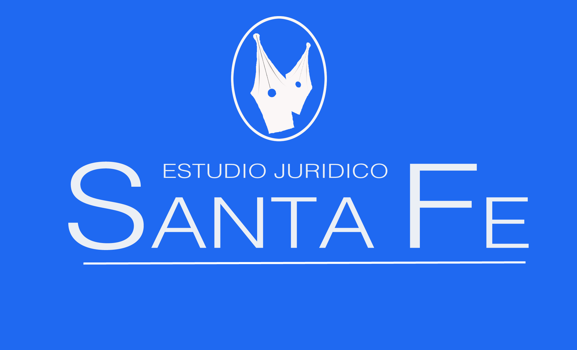
I agree with much of what Hueroth commented with the exception of the number of pen tips. I think if you going to have just one, then there needs to be a little more detail to quickly distinguish what it is. If not, then it could be a tent or part of a crown. I would also increase the weight of the "anta e" letters to match the weight of the "S" and "E"
6 Comments
A less burning blue, if possible, "estudio juridico" at the bottom, under the line and align with "santa", and just one nib, vertical, two nibs are too much, also put the nib in a circle not in an oval.
I agree with much of what Hueroth commented with the exception of the number of pen tips. I think if you going to have just one, then there needs to be a little more detail to quickly distinguish what it is. If not, then it could be a tent or part of a crown. I would also increase the weight of the "anta e" letters to match the weight of the "S" and "E"
I try some diferent fonts... thouse are to simple. To be honest i like the idea, but I think you have to work a lot in the symbol.
Le falta bastante.
Sorry, nothing works here. The font is way too plain and the symbol doesn't say anything.
gracias colegas por los aportes brindados un abrazo