The Being House
Brief from client
Home for uncommon scents, sacred skincare and a future spa. This brand represents a middle way between the perfume industry & aromatherapy / wellness industry. Perfumes with purpose using only pure essential oils and natural carrier oils
No alcohol. No sin-thetics. No BS. The perfumes, fragrances and skincare lotions are made of natural blends with benefits.
With an introductory line of 7 perfumes, each one is blended with the intention of corresponding and promoting energy flow in the body. We have 7 main energy vortices in the body (chakras) and so wether it be a throat (expression) based perfume or a heart-opening based perfume, the art is in creating complex, non medicinal smelling fragrances that have the nuance and thoughtfulness found in great perfumes whilst naturally affecting and promoting inner wellbeing in the same way that eucalyptus opens our respiratory channels or lavender promotes relaxation.

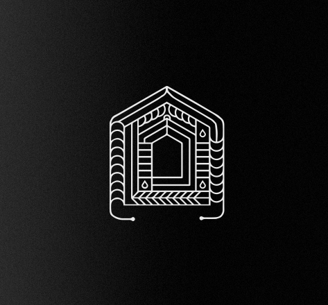
The intention with this logo was to allude to our inner home, our inner being, and as complex as we may be, we are always home to ourselves.
I also am alluding to the future bath house that The Being House envisions. Since these perfumes are targeting wellbeing as much as agreeable cosmetic scent, I thought to create a logo that is holistically representing and depicting this brands vision, all the way to the longterm venture of building a physical destination for people.
I wanted the logo to feel like an architectural blueprint or drawing of how the bathhouse will look whilst imbuing it with a symbolic emblematic feel. Since this logo would be on every one of the 7 bottles, I intent to have the mini house within filled with a color corresponding to the chakra being affected. Red, Blue, Green etc...
I integrated drops to represent the purity of the perfume, the purity of life, the purity of water, the reference to bath houses, steam rooms and the effect of maximizing energy flow, just like how water flows.
I feel that the logo is very complex and detailed, and am aware that once sized smaller, may be hard on the eyes.
But I love it's solidity, and complexity. I feel it is intriguing and compelling in a way where you just want to explore the logo like a puzzle...
I know this may not be the right approach for a memorable, easy to get logo... I hope I can get feedback that will guide me into maintaining the elements I love about the logo whilst perhaps simplifying it without sacrificing visual / narrative impact.


4 Comments
This is looking amazing! Great work.
I'd love to see the whole thing, with wordmark and all.
Thank you! I am still working on wordmark and the rest. I am looking for a graphic design to help with font and all... this is what i have so far just out of my own doing. Btw, this is also the newest logo, lmk if you dig!
I just cant find all these chakras & new age marketing in it, sorry,
but I while I find it a bit overcomplicated I just love this delicate blueprint idea, it will work marvelously on a apropriate bottle
blueprint means order, harmony, trust, safety
yup, Iike it
thank you! here is a new version, more delicate, refined.. and inside the lill house will be the color of the chakra that corresponds to the blend in the perfume bottle. Perhaps its in the label graphics , or artwork that will communicate the chakras... I also want to find a clean balance between minimalism and the simple beneficial truth found in plant essences. I really appreciate your feedback, lmk what you think?