The have foundation
LindseyK25 | Sat, 08/04/2012 - 00:16
Brief from client
I am working on this logo for my husbands foundation. check out the description right below. Thanks!
FOUNDATION DESCRIPTION:
The Have ( Helping American Veterans Excel) Foundation exists to provide means in which to reintegrate, reestablish, and provide assistance for American Veterans and their families in civilian life.
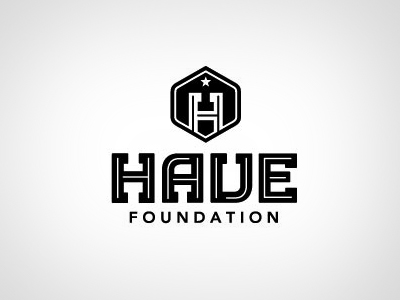
This version.. for the H in the icon I see it as it coming up over the horizon into new possabilities, also the shape of the H also somewhat looks like to people shaking hands or giving a helping hand.
I want these logos to have a hint of a patriotic, military feel but not too much. I also wanted it to have a modern look to it.
7 Comments
Nice emblem, I love the logo. although i do not see 2 hands shaking. but none the less still think it looks fantastic. My only advice is the "have" font size overpowers the emblem. Its a great emblem and should be bigger in comparison to the "HAVE" but hey... love it great!
Nice job here. As carlgoldson said "no hands shaking". But the logo is beautiful.
I like it.
I like it
Well Done!
I agree with everything above! I don't see the hands shaking, I do think that the emblem should be larger- but overall this is lovely! Nice job!
very nice, i do think the emblem should be larger and i think this version is nicer than the other. one thing im not sure about is the thin white lines in the font, not sure that they are necessary and dont no how well you would see them if the logo is printed small. I do see hands shaking only because you pointed it out though but i think it works well as it matches the hop half of the "H"
Good Job!