Brands of the World is the largest free library of downloadable vector logos, and a logo critique community. Search and download vector logos in AI, EPS, PDF, SVG, and CDR formats. If you have a logo that is not yet present in the library, we urge you to upload it. Thank you for your participation.


9 Comments
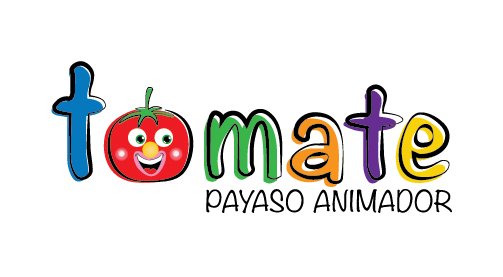
The old tomato wasn't much to look at, but this one is terrifying to me for some reason, that may be a personal opinion sort of thing though. I prefer the colors in the previous version, this is just too much here. I think the direction this logo is going is pleasant, I just think adding a clown nose to a tomato may be a bit too much for one logo to handle...
LOL you were able to fit all those elements into one piece good work, i would like to see it more refined tho. maybe loose the pink white circles or drop that to 1 color? i think ur on a better track but needs work also simplify the eyes a bit more to much detail in small portion? as for the colors to i like but i am not loving...
thanks, well, my client asked me those colors, i'll work on improving tomato
great
My personal opinion is to keep the tomato graphic flat 2D. the rest is very good.
I agree ... it's much better
i like but the typography dont like....
I agree with Monito
Te sugiero minimizar los elementos del tomate. Algo no me gusta mucho y e que la tipografía parece de un libro de escuela, lo cual no crea un elemento diferencial... a la hora de crear marca!